This product has been discontinued by the manufacturer. It's been replaced by the Hammerhead Karoo 3, you may want to check out that review instead.
I’m DC RAINMAKER…

I swim, bike and run. Then, I come here and write about my adventures. It’s as simple as that. Most of the time. If you’re new around these parts, here’s the long version of my story.

You'll support the site, and get ad-free DCR! Plus, you'll be more awesome. Click above for all the details. Oh, and you can sign-up for the newsletter here!
Here’s how to save!
Wanna save some cash and support the site? These companies help support the site! With Backcountry.com or Competitive Cyclist with either the coupon code DCRAINMAKER for first time users saving 15% on applicable products.
You can also pick-up tons of gear at REI via these links, which is a long-time supporter as well:Alternatively, for everything else on the planet, simply buy your goods from Amazon via the link below and I get a tiny bit back as an Amazon Associate. No cost to you, easy as pie!
You can use the above link for any Amazon country and it (should) automatically redirect to your local Amazon site.
While I don't partner with many companies, there's a few that I love, and support the site. Full details!

Want to compare the features of each product, down to the nitty-gritty? No problem, the product comparison data is constantly updated with new products and new features added to old products!

Wanna create comparison chart graphs just like I do for GPS, heart rate, power meters and more? No problem, here's the platform I use - you can too!

Think my written reviews are deep? You should check out my videos. I take things to a whole new level of interactive depth!

Smart Trainers Buyers Guide: Looking at a smart trainer this winter? I cover all the units to buy (and avoid) for indoor training. The good, the bad, and the ugly.
-
Check out my weekly podcast - with DesFit, which is packed with both gadget and non-gadget goodness!

Get all your awesome DC Rainmaker gear here!
FAQ’s
I have built an extensive list of my most frequently asked questions. Below are the most popular.
- Do you have a privacy policy posted?
- Why haven’t you yet released a review for XYZ product you mentioned months ago?
- Will you test our product before release?
- Are you willing to review or test beta products?
- Which trainer should I buy?
- Which GPS watch should I buy?
- I’m headed to Paris – what do you recommend for training or sightseeing?
- I’m headed to Washington DC – what do you recommend for training?
- I’m from out of the country and will be visiting the US, what’s the best triathlon shop in city XYZ?
- What kind of camera do you use?
-
5 Easy Steps To The Site
In Depth Product Reviews
You probably stumbled upon here looking for a review of a sports gadget. If you’re trying to decide which unit to buy – check out my in-depth reviews section. Some reviews are over 60 pages long when printed out, with hundreds of photos! I aim to leave no stone unturned.
Read My Sports Gadget Recommendations.
Here’s my most recent GPS watch guide here, and cycling GPS computers here. Plus there are smart trainers here, all in these guides cover almost every category of sports gadgets out there. Looking for the equipment I use day-to-day? I also just put together my complete ‘Gear I Use’ equipment list, from swim to bike to run and everything in between (plus a few extra things). And to compliment that, here’s The Girl’s (my wife’s) list. Enjoy, and thanks for stopping by!
Have some fun in the travel section.
I travel a fair bit, both for work and for fun. Here’s a bunch of random trip reports and daily trip-logs that I’ve put together and posted. I’ve sorted it all by world geography, in an attempt to make it easy to figure out where I’ve been.
My Photography Gear: The Cameras/Drones/Action Cams I Use Daily
The most common question I receive outside of the “what’s the best GPS watch for me” variant, are photography-esq based. So in efforts to combat the amount of emails I need to sort through on a daily basis, I’ve complied this “My Photography Gear” post for your curious minds (including drones & action cams!)! It’s a nice break from the day-to-day sports-tech talk, and I hope you get something out of it!
The Swim/Bike/Run Gear I Use List
Many readers stumble into my website in search of information on the latest and greatest sports tech products. But at the end of the day, you might just be wondering “What does Ray use when not testing new products?”. So here is the most up to date list of products I like and fit the bill for me and my training needs best! DC Rainmaker 2024 swim, bike, run, and general gear list. But wait, are you a female and feel like these things might not apply to you? If that’s the case (but certainly not saying my choices aren’t good for women), and you just want to see a different gear junkies “picks”, check out The Girl’s Gear Guide too.


![clip_image001[12] clip_image001[12]](https://media.dcrainmaker.com/images/2023/06/clip_image00112_thumb.jpg)
![clip_image001[6] clip_image001[6]](https://media.dcrainmaker.com/images/2023/06/clip_image0016_thumb.jpg)
![clip_image001[8] clip_image001[8]](https://media.dcrainmaker.com/images/2023/06/clip_image0018_thumb.jpg)
![clip_image001[4] clip_image001[4]](https://media.dcrainmaker.com/images/2023/06/clip_image0014_thumb.jpg)
![clip_image001[10] clip_image001[10]](https://media.dcrainmaker.com/images/2023/06/clip_image00110_thumb.jpg)
![clip_image001[14] clip_image001[14]](https://media.dcrainmaker.com/images/2023/06/clip_image00114_thumb.jpg)
![clip_image001[16] clip_image001[16]](https://media.dcrainmaker.com/images/2023/06/clip_image00116_thumb.jpg)
![clip_image001[18] clip_image001[18]](https://media.dcrainmaker.com/images/2023/06/clip_image00118_thumb.jpg)










Thanks for the post Ray. Any idea if they push updates to a beta or subset group of users, or more of a dive off the cliff all at once approach? With such a dramatic change, and no way way for a user to toggle back to a ‘classic’ theme, any change like this is quite risky. Especially if you elude to it being a prereq for some great new changes coming soon, ie: this might seem like a step backwards, but here’s a teaser of substance that shows real value to the users coming soon!
If there’s potential great new hardware coming soon, this is somewhat reminiscent of, right or wrong, Apple’s battery gate. Claw back UX that users live, or force a planned obsolescence software update on the users in the attempt to sell more new ‘and improved’ units coming soon? As there’s simply not enough Hammerhead fan boys out there in comparison to Apple addicts, this could completely backfire on them. Looking forward to seeing them quickly course correct here.
And BTW, I think you meant bit vs but here: “but more…boxy”
Thanks as always!
It brings back troubling memories of early X Windows / Motif widgets.
While I agree that it makes far more sense to launch a K3 in summer (and things may be different with SRAM involved), the K2 originally launched in the fall. I remember because I had a preorder that I cancelled because it didn’t make sense for me to get a bike computer until the following spring.
The sin for me is that the data field labels are large (and they leave 2 lines for each) which shrinks the size of the data itself. My eyes aren’t what they use to be. Need big numbers.
Reminds me of the trip computers from the gpsmaps 60/76 series circa mid 2000s. And yes very motif widget toolkit like.
Thanks for pointing this out, Ray. I’m one of the “rebels” and am completely dismayed, not only for the obvious shortcomings of the redesigned, but also because I just can’t figure out the WHY. Hammerhead has been making a lot of noise since they started selling the Karoo 2 and, with the new price, it’s just the best bike GPS out there. This, in the best-case scenario, looks like a solution in search of a problem. And in a “just-normal” scenario, is just plainly and obviously ugly and a mistake. What were they thinking?
I am in search of my fist bike computer. Always liked the Karoo but the price was prohibitive for me. At the current sale price, I am very seriously considering ordering one.
As it would be my first computer, the updated UI would not be as much as a shock to the system as it would be for long timers. That being said, it is ugly and much prefer the old UI, especially with my old tired eyes that require reading glasses.
Thankfully Hammerhead has those bi monthly updates, and hopefully they make the necessary changes.
I was the only guy on the forums who actually like the update. I use it in dark mode and the display is clearer on my 56 year old eyes. It looks cool in dark mode.
Anyway it sounds like it is part of a bigger plan involving K3 so I hope the Internet can be a bit less like Comic Book Guy and wait and see where they are going with this.
Based on what you have said about HH and my experience they are keeners trying to make the best product. Hopefully they will add a Tide Checker in the next release.
I logged a support complaint and also received that exact response. I imagine at some point they got the message and directed marketing to come up with a canned auto issue response to placate the complainers. What I tried to explain and what few get is that as I age I already require cheaters to read, I already am using cheater riding glasses, and the LAST thing I need is them to spell out words to where it requires two lines of text which means squeezing the actual data I’m trying to see.
The trends have been to bigger screens and they actively sat in rooms and decided that it made sense to make things on the screen smaller. It was an actual decision and people said yes let us roll with this. There was nothing about this ‘enhancement’ that solved a problem or was “timely” that it had to be pushed through so why?
If they went to their beta team and got approval, then they need some diversity on their beta team.
I sarcastically stated that they made their head unit so cheap now I guess this release was to make us buy a second one so we could see all the data we want without having to swipe screens.
melodramatic – sure. Did it stop me from using it this weekend nope, although I was irritated every time I glanced at it.
This seems like it could have been handled with a simple menu option. Display full text on screens y/n
I think they have drastically underestimated their user base. We are sensing they are falling behind the curve with the lack of a K3 and it is starting to feel like we are getting left behind with both hardware and software.
I absolutely do not understand “dark mode” and the fascination with it. I believe that it was developed, as the name suggests, the be significantly better when there is limited light and to reduce eye strain with brightness in limited light. So just from that alone I cannot accept it can be “better” in full daylight conditions. I can accept people have preferences, everyone is different and some like might like it.
I do not, I do not see it as a ‘fix’ and all technology is ‘going’ somewhere. I do not think however that it needs to go backwards first to move forward.
You may want to follow this piece up with how Garmin just practically killed the 1030 last month with update 13.75. Sensor and phone disconnects are crazy. I changed batteries in my Wahoo cadence sensor twice thinking that was the problem but had problems with hrm and phone as well. I tried a bluetooth Powercal after my other hrm kept dropping and it wouldn’t stay connected or enumerate as a power meter. It’s a crapshow for Garmin. Garmin has tried to rectify the problem with a beta 13.79 but the forums continue to have comments on the problem. At least Hammerhead didn’t kill sensor support. If Garmin didn’t or doesn’t fix it, $259 seems pretty reasonable to have sensors working.
Here’s there fix where Garmin admits the sensor dropouts. https://forums.garmin.com/beta-program/edge-530-830-1030-series/f/announcements/334458/xx30-series-new-betas—special-notes-in-post
As a karoo2 user and lover of the brand, I hope Hammerhead steps back and corrects this mess.
Same here, I went from 100% “recommend to anyone I know” to “don’t buy for now”. I very much regret installing the update before checking. Until now it was always an improvement…
The update is awful. Why why why would they choose this and on top of it, STILL no option to center the data in the terrible “bubbles”.
Also is it officially 5 android generations behind? Most of the side loaded options, which was the best function of the K2 when it first came out, don’t even work anymore because this OS is so old.
Well, even in dark mode the new layout looks hideous!
I have no idea how this could ever get past of the first preliminary checks of their quality department 🥺
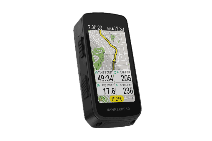
But besides the dated (or downright ugly) look, the actual data in the tiles occupies in most cases only about a quarter of the tile itself. The rest is either empty space or a completely useless large caption. The display was hard to read in bad lighting conditions before, now it’s impossible!
This is so laughably bad that whomever approved and designed it should be removed from decision making roles.
Totally
As a person, who isn’t in the target audience, I’d say the new UI is slighly more obvious in terms of showing that I can tap a datafield to change it (whereas with the old UI it’s something you need to figure out on your own or read in the manual)
I’m waiting for the Karoo 3 since late 2022.
If it comes in June, you would already be in possession of one ofcourse, to post the review on the day of arrival ;)
I try to read in between the lines, and I guess you’re writing them to urge them to release. Or i just want to read that :p
I logged a support complaint and also received that exact response. I imagine at some point they got the message and directed marketing to come up with a canned auto issue response to placate the complainers. What I tried to explain and what few get is that as I age I already require cheaters to read, I already am using cheater riding glasses, and the LAST thing I need is them to spell out words to where it requires two lines of text which means squeezing the actual data I’m trying to see.
The trends have been to bigger screens and they actively sat in rooms and decided that it made sense to make things on the screen smaller. It was an actual decision and people said yes let us roll with this. There was nothing about this ‘enhancement’ that solved a problem or was “timely” that it had to be pushed through so why?
If they went to their beta team and got approval, then they need some diversity on their beta team.
I sarcastically stated that they made their head unit so cheap now I guess this release was to make us buy a second one so we could see all the data we want without having to swipe screens.
melodramatic – sure. Did it stop me from using it this weekend nope, although I was irritated every time I glanced at it.
This seems like it could have been handled with a simple menu option. Display full text on screens y/n
I think they have drastically underestimated their user base. We are sensing they are falling behind the curve with the lack of a K3 and it is starting to feel like we are getting left behind with both hardware and software.
Its hard to read HH, as they only post mostly blurb robotic answers. Time will only tell what’ll happen on this. I’ve been on the community for 2yrs and theirs been rebukes on certain software updates and irritancies like cancelling auto-rerouting but this is quite big for HH which they can’t really afford, they’ve lost Shimano users and to lose more would be catastrophic, I don’t know if SRAM know how HH is working cause something’s not iron clad in their software decisions and releases.
It sounds to me like they’re implying these visual changes are tied to larger under-the-hood changes to the software (that will pay off down the line). Maybe I’m just reading into it too much?
10 field display really highlights the problem. Don’t size is about 40% smaller, see the photo here.
I use this heavily and it sucks, actually still readable for me in the 8 or less field screens, but some people have worse eye sight than me.
*font * size lol
At least you are only using 1 line descriptions. Add in the field 3 second average power and the display goes to two lines of text and squeezes the data field even more. I don’t even ‘need’ the full description, it is for MY use. 3s would be enough I KNOW its 3 second average. “I”f is good enough I know it stands for intensity factor. I would know w/kg would stand for power to weight etc. Why do they insist on spelling everything out?
Oh but I am on other screens. But in these fields they fill it with whitespace anyway. The vertical pixels for the labels are the same.
Does IF, and Average powers data fields still read “searching” when the PM disconnects?
It looks like something made in dBase IV.
I waded well in to this debacle on that forum, I use light in the day and dark at night and on the trainer.
It’s still readable and well usable but that fact the font size has became smaller, glancing the figures is well harder now and you have to ‘look’ at the display to see the figures instead of just a quick check, it’s a very very sorry state of affairs to near radically change a UI appearance to this degree.
WOW! This looks poorly thought out and a bad decision. An option to roll back to the original interface and reduce font size should have been included.
I hadn’t thought about the Android version and how sideloading apps may make said apps no longer functional.
Makes me happy that I turned off updates after adding the climber feature but before Hammerhead was forced to remove Di2 support :)
Almost looks as if SRAM did what every self-respecting buyer would have done, lay off the expensive New York team and outsource further development to the lowest bidder?
I’d they don’t watch it, they may be on the way down..
I would say this is an update which is actually designed for the hammerhead 3. The price reduction of the 2 would suggest the 3 is in the pipeline and it seems common practice for all models to use the same OS and software (just look at wahoo and garmin).
So what might not look great on the hammerhead 2 may actually look much better on the 3 (when it’s released).
True, like this is a UI that would suit a bigger screen.. 🤔
I don’t have any problem with the basic idea- having separation between data fields.I have problems with the implementation.
1) Center the data in the space. I have 1 data value per line on my screens. It all sits to the far right of the screen which leaves most of the screen blank.
2) The data field labels are WAY too big. Use the space to make the data as large as possible. The labels can be tiny or icons or whatever. After using the unit once or twice I know what the data fields are just from the data itself (275W of power would never be mistaken for HR or distance or time). You don’t need giant labels.
3) I have bad reading vision. MAKE THE NUMBERS AS LARGE AS POSSIBLE. Then I can read them without glasses. I don’t care about the labels.
Personally, I always use dark mode and I LIKE the new data page design. It helps me sort out what I am looking at.
2 year old conversation on karoo community about using screen space efficiently. link to support.hammerhead.io
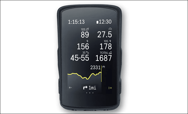
“Storm in a tea cup” in my opinion. I fail to see why it is old-fashioned, it’s more organised. Rays’ picture of the old UI shows just a bunch of numbers on a screen. The new UI delineates each field.
I like the larger Data-Field text as I don’t always remember what the field is showing (some field can have similar data; e.g.. HR / Cadence).
However:
1) I think they should keep to a single line of Data Text; most abbreviations of the Data Fields are obvious
2) The Font Size (with 8 Data fields) is ok but the Font needs to be Bold (i.e. fatter) for more legibility. I still also ride with a Garmin 1000 which with 10 Data Fields has the same Font size as the K2, only the 1000 has a much bolder Font and is more legible.
(Note: with the K2 at 8 DFs it shows 1 more Data Field than the 1000 as the top bar has 3 DFs already; i.e. K2 11 – 1000 10.) Why anyone wants more than 11 DFs on one Data Page is beyond me, define another one and swipe. But each to their own.)
3) The W-on-B mode is more like dirty white when I’m riding in the sun. I have the display at 80%, but it’s often still too dim. With 5 Sensors, 3 Data Pages + Map, I only get about 6.5-7hrs of battery. I probably need the Display at 100%, but that would drain the battery too quickly.
4) The box lines are to definitely too big in the B-on-W mode and shows too much grey in between. The Garmin also has the DFs in boxes but with a much thinner line and no grey space. HH should copy this.
I use W-on-B as I assume it saves battery, no proof of that though. At the time of the upgrade I actually switched to B-on-W and was surprised by the UI, I didn’t realise it had changed. What I found really annoying was the nearly empty grey bar at the bottom of the screen which is twice the size of the upper Data Field bar (Times/Battery etc.). I switched-off the “Show Buttons” which got rid of this bar and it now only comes when navigating for the “Next Turn” info.
I have subsequently switched back to W-on-B and as Ray states, you don’t see much of the boxes, only when the light drops (tunnel etc.)
Final note on the right justification – it’s a bit pedantic, numbers are usually right justified. For full-width DFs it may be more pleasing to be centre justified, but is really an issue?
Perhaps HH could give an option or just change to stop to the polemic.
The K2 is still far better than the 1040, which in my opinion is a piece of junk. I sent mine back and reverted to the 1000 for use with G-Connect which is better that the Dashboard.
Ironically, I feel like the Karoo 2 data page config screen is actually the middle ground people want in-ride (see attached).
+1
As a new HH K2 user (1 week). I did really like this screen layout when I was setting up the K2. To me the regular new interface is a step down in readability from this particular screen.
To be specific I’ve only used the new interface and have no experience with the former interface, so can’t comment on that. But still, I do agree with your comment that it would be preferable to have a regular interface with design clues from the data page config screen for readability and aesthetics.
With my Wahoo Bolt V1 randomly shutting down after less than 6 hours it is time for a new computer. I was looking at the K2 and the next day the price dropped. Then Wahoo’s reply to my concern said – “Sorry, it’s almost 5 years old and out of warrantee, nothing we can do – but here’s a 20% off code”. So, wanting a bigger screen than the Bolt, I can get a K2 for $259, or a Roam V2 for $320.
My concerns with the K2 is battery life for all day rides and their customer service. I’m seeing comments like this:
“… I only get about 6.5-7hrs of battery. I probably need the Display at 100%, but that would drain the battery too quickly.”
This firmware update/change in UI is, for me, an opportunity to see how Hammerhead deals with their customer base.
I can get by with the Bolt for a another month or so, so I’m going to hold off for now, see how Hammerhead handle this and know that my Wahoo code is good for a year. Right now I’m leaning toward the Roam V2, but I’m open to suggestions…
I took a chance on the Karoo 2. Having Buyer’s remorse. Did a 100km ride with an old (at least 5 years) Wahoo Elemnt Bolt, and a couple month old Karoo 2. Identifical data fields, both connected to the same HRM.
Wahoo spent 35% of battery, Karoo 2 55%.
As someone who does long bike rides, then only way the Karoo with work is with an external battery.
Maybe performance can be tweaked, but, considering that I’m using out of the box default settings, pretty disappointed.
Battery life of Karoo 2 being much lower than Wahoo or Garmin devices is pretty common knowledge and aligns with the specs that Hammerhead have shared and everything I’ve read on multiple reviews. I just purchased / haven’t used mine yet, but wouldn’t have bought it if longer rides without a battery pack was a requirement.
Agree, also, keep in mind that backlight is the most critical factor for the Karoo 2 in terms of battery burn.
However, doing 100KM shouldn’t be an issue at all. I’ve done countless 100KM with it, without problem.
Now, if you’re doing 8hr+ rides, then yup, it’ll be a problem (as I outlined in my initial review). That hasn’t meaningfully changed.
Battery life is OK. Last week did a 9h ride with 7h48m moving time (167km / 3800m climbing) with 26% remaining. 8.2% / hr on average.
link to analyze.dcrainmaker.com
I carry a small external battery for >10h rides but never needed to use it.
I did a 5,5 h / 123 km gravel ride yesterday. Navigation and map screen on whole ride, HRM connected, screen brightness 50 % and dark mode. Had 55% of battery left when I got home. I can’t fault that in any way.
Wann wird endlich das Höhenproblem behoben? Hatte schon 4 Karoo, alle das selbe Problem. Oft doppelte Höhenmeter. Problem seit einem Jahr bekannt, keine Lösung in Sicht.
I personally like the idea of a new device coming in the fall … then someone else can be first movers and find the annoying errors, so they are fixed for when I buy it next spring 🤣
This past Saturday I went for a brief ride before a father’s day musical performance. There was a notice of upgrade to my Karoo2 so I immediately approved the upgrade. The ride started and I thought that something had happened to the screen, not the custom one I had established. I went through the 3 options on my custom pages questioning what had happened from the day before. Now that I know that the change was not random I reluctantly accept the changes with the hope that there will be a return to what was before, which was friendly and comfortable. Regardless, the Karoo2 remains my favorite, decent battery life, regular updates, climbing data, plus, the name Hammerhead relates to the Jeff Beck instrumental of the same name.
Thanks Ray for the article.
I’m pretty ‘shaken’ by the size reduction of the data fields (in my rough estimates down to 5/8 of original size on a 10 field screen).
As someone who needs reading / screen glasses at this distance, to read comfortably, but could cope with the original design, I was shocked.
We’ll see if HH responds appropriately.. (Lol, if not, do you happen to have an ipa or something lying around of the previous version 😁).
What surprises me and I find disturbing is that on the “Now on sale for 259” site, they use screenshots of the nice previous design.. I wonder how new buyers are going to feel after the first “Upgrade”
The issue is, they took away display data space in order to put unnecessary borders around the data and to provide two lines (!) for ridiculously long labels – like CALORIES (POWER) instead of kcal and SPEED instead of MPH or KMH. The reason many people buy the Karoo2 or a Garmin 1040 is the large numbers in the display – especially us older riders whose close vision isn’t what it was. On my summary screen, the actual data values were half the size they were prior to the update.
The fix is a half measure. They still allocate two lines labels and the data values are still smaller than they were prior to the botched update.
Welcome to the world ruled by idiot UI designers and their “trends” where they just LOVE WHITESPACE so much that they forget that someone has to use their shitty designs.
This trend started a decade ago and is crawling everywhere. From banking sites to apparently bike computers.
More whitespace less data.
That’s ugly. Putting boxes around stuff doesn’t make it easier to read. It just clutters the screen. We can only take in so much and then it’s noise. Design 101
Love your work. We ride tandems, and now use Karoo 2s front and back!
For those coming to this article months later after it was written, rejoice!
ICYMI, on June 29th Hammerhead added a “Data Field Design” setting, which removes the ugly boxes (i.e. returning the popular “flat” design).
Yes we know 👍 thank you kindly