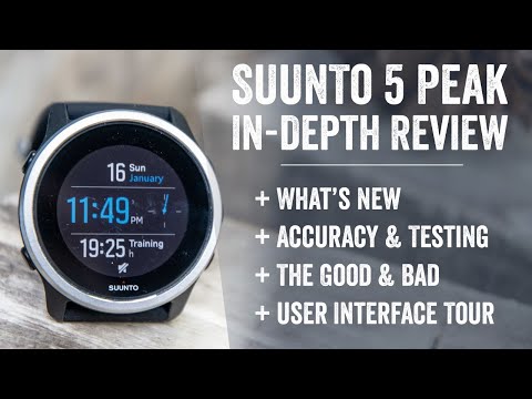
This will be my most efficient post of the month! This is a super quick FYI post to let ya know that I’ve posted the Suunto 5 Peak In-Depth Review video up on YouTube, inclusive of about a 10-minute user interface tour/overview.
This is in addition to the existing written Suunto 5 Peak In-Depth review that I published last week. Though in this video I dive into the user interface a bit more and show how the watch works in video, so you can see things like responsiveness. Here’s the quick overview of what’s in the video, with the exact timestamps to take you to the right sections:
0:00 Intro
0:45 What’s New
3:05 The Main Specs
4:24 Suunto 5 Peak vs Suunto 9 Peak
5:31 Suunto 5 Peak vs Suunto 7
6:31 The Good
8:38 The Bad
10:33 Detailed User Interface Guide
19:00 Wrap-Up & Recommendations
But like I said, this post is all about efficiency, as I’m cooking on some other things for later today.
With that – thanks for watching!
FOUND THIS POST USEFUL? SUPPORT THE SITE!
Hopefully, you found this post useful. The website is really a labor of love, so please consider becoming a DC RAINMAKER Supporter. This gets you an ad-free experience, and access to our (mostly) bi-monthly behind-the-scenes video series of “Shed Talkin’”.
Support DCRainMaker - Shop on Amazon
Otherwise, perhaps consider using the below link if shopping on Amazon. As an Amazon Associate, I earn from qualifying purchases. It doesn’t cost you anything extra, but your purchases help support this website a lot. It could simply be buying toilet paper, or this pizza oven we use and love.


This new Suunto 5 Peak is looking good! I’ve read some rumors about a firmware update that’s landing soon. Let’s see if Suunto managed to include some of the missing features making this and the 9 Peak even better.
Hi Ray,
The display is ‘previous generation’ and not that bright. However, I am really curious how the screen compares to an older watch like a Garmin forerunner 235. Are we talking about the same performance in readability? Or is the Suunto 5 screen also performing less compared to a Garmin forerunner 235?
/ Wim
Yeah, I haven’t used a FR235 in a while (it’s a 6.5yo watch), but in looking at things, I’d say it easily beats the readability of the Suunto 5 Peak.
I think the issue is likely three-fold:
A) The display itself may be less ideal
B) The layer atop the display (glass/plastic/etc may be causing undue something)
C) The fonts and UI elements they use.
For example, they tend to use smaller fonts with white lettering on black, which in general, tends ot be harder to see than the larger fonts/UI that Garmin/Polar/COROS/Wahoo use on the same size screens. Thus, it compounds any actual display/covering issues. So what the core of the issue is, I don’t know. But I know what the result is.