Last call for sports tech deals before New Year!! Most of these are still live till Dec 31st. The Garmin Fenix 8 is $250 off to $749, (even the Fenix 8 Pro is $100 off!), the Apple Watch Ultra 3 is on sale, the Garmin inReach Mini 2 is $249, the GoPro Hero 13 Black, DJI NEO, and a ton of other brands/deals, including Wahoo, Oura, Whoop, Polar, Samsung, Google, and more than 100 sports tech deals here!
I’m DC RAINMAKER…

I swim, bike and run. Then, I come here and write about my adventures. It’s as simple as that. Most of the time. If you’re new around these parts, here’s the long version of my story.

You'll support the site, and get ad-free DCR! Plus, you'll be more awesome. Click above for all the details. Oh, and you can sign-up for the newsletter here!
Here’s how to save!
Wanna save some cash and support the site? These companies help support the site! With Backcountry.com or Competitive Cyclist with either the coupon code DCRAINMAKER for first time users saving 15% on applicable products.
You can also pick-up tons of gear at REI via these links, which is a long-time supporter as well:Alternatively, for everything else on the planet, simply buy your goods from Amazon via the link below and I get a tiny bit back as an Amazon Associate. No cost to you, easy as pie!
You can use the above link for any Amazon country and it (should) automatically redirect to your local Amazon site.
While I don't partner with many companies, there's a few that I love, and support the site. Full details!

Want to compare the features of each product, down to the nitty-gritty? No problem, the product comparison data is constantly updated with new products and new features added to old products!

Wanna create comparison chart graphs just like I do for GPS, heart rate, power meters and more? No problem, here's the platform I use - you can too!

Think my written reviews are deep? You should check out my videos. I take things to a whole new level of interactive depth!

Smart Trainers Buyers Guide: Looking at a smart trainer this winter? I cover all the units to buy (and avoid) for indoor training. The good, the bad, and the ugly.
-
Check out my weekly podcast - with DesFit, which is packed with both gadget and non-gadget goodness!

Get all your awesome DC Rainmaker gear here!
FAQ’s
I have built an extensive list of my most frequently asked questions. Below are the most popular.
- Do you have a privacy policy posted?
- Why haven’t you yet released a review for XYZ product you mentioned months ago?
- Will you test our product before release?
- Are you willing to review or test beta products?
- Which trainer should I buy?
- Which GPS watch should I buy?
- I’m headed to Paris – what do you recommend for training or sightseeing?
- I’m headed to Washington DC – what do you recommend for training?
- I’m from out of the country and will be visiting the US, what’s the best triathlon shop in city XYZ?
- What kind of camera do you use?
-
5 Easy Steps To The Site
In Depth Product Reviews
You probably stumbled upon here looking for a review of a sports gadget. If you’re trying to decide which unit to buy – check out my in-depth reviews section. Some reviews are over 60 pages long when printed out, with hundreds of photos! I aim to leave no stone unturned.
Read My Sports Gadget Recommendations.
Here’s my most recent GPS watch guide here, and cycling GPS computers here. Plus there are smart trainers here, all in these guides cover almost every category of sports gadgets out there. Looking for the equipment I use day-to-day? I also just put together my complete ‘Gear I Use’ equipment list, from swim to bike to run and everything in between (plus a few extra things). And to compliment that, here’s The Girl’s (my wife’s) list. Enjoy, and thanks for stopping by!
Have some fun in the travel section.
I travel a fair bit, both for work and for fun. Here’s a bunch of random trip reports and daily trip-logs that I’ve put together and posted. I’ve sorted it all by world geography, in an attempt to make it easy to figure out where I’ve been.
My Photography Gear: The Cameras/Drones/Action Cams I Use Daily
The most common question I receive outside of the “what’s the best GPS watch for me” variant, are photography-esq based. So in efforts to combat the amount of emails I need to sort through on a daily basis, I’ve complied this “My Photography Gear” post for your curious minds (including drones & action cams!)! It’s a nice break from the day-to-day sports-tech talk, and I hope you get something out of it!
The Swim/Bike/Run Gear I Use List
Many readers stumble into my website in search of information on the latest and greatest sports tech products. But at the end of the day, you might just be wondering “What does Ray use when not testing new products?”. So here is the most up to date list of products I like and fit the bill for me and my training needs best! DC Rainmaker 2024 swim, bike, run, and general gear list. But wait, are you a female and feel like these things might not apply to you? If that’s the case (but certainly not saying my choices aren’t good for women), and you just want to see a different gear junkies “picks”, check out The Girl’s Gear Guide too.

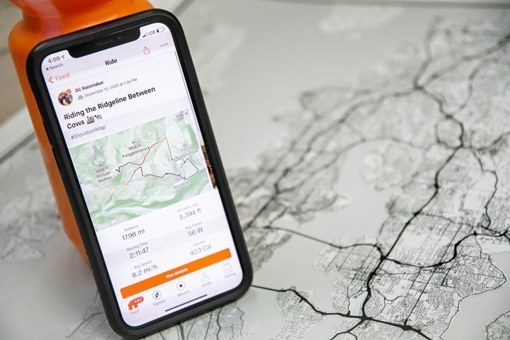
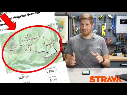
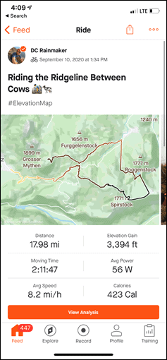
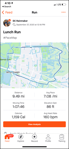
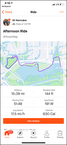
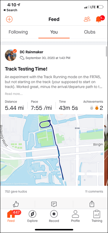
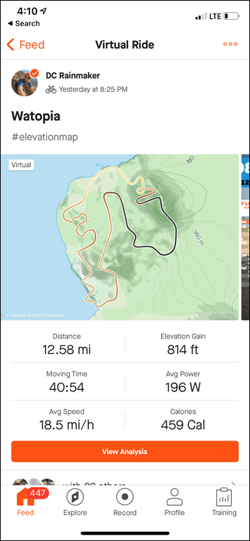








So this works fine, but I now have no Fly-Bys. Did they do away with those?
Just my Flybys, it seems. I restricted my privacy settings a few months ago, but was still able to see Flybys from other folks in my ride details. Now I can’t. Oh well. No biggie.
This tip doesn’t help? link to support.strava.com
This is remarkably similar to the newly introduced Garmin feature!
Except with the Garmin version you can zoom in and get more granular; the Strava version only shows on summary page, not on activity details page.
Which really diminishes the usefulness of the Strava feature, IMO.
Yup, so far it’s a pretty half-assed implementation.
Wauw, I remember having the idea of colorizing the track based on other data fields and coding it out years ago! I didn’t even have my own gps to generate tracks. Wasn’t aware that it became a ‘thing’ on sporting platforms recently :)
Too bad that it’s only the overview map and not the larger activity map though.
Also, it doesn’t seem to work in activities that you ‘did with’ someone.
The behaviour of Strava web compared to the app is different: the app shows gradient in activity feed (even when multiple participants) and also when you open the activity. Zooming in on the map however is not supported…
Would be nice to have a menu when you save your activity rather than using hashtags but otherwise I like it.
What’s the difference between speed and pace? shouldn’t those always have the same colour?
putting my mad google skills to the test today
link to differencebetween.com
This is not a very useful feature with it only showing in the feed. It might as well be random colors. Isn’t the value in the kind of data when you can gain some knowledge about your race or training? I want to be able to zoom in and see the spots where I was faster or slower, etc.
cue sporttracks…..or probably everyone else. But I know on sporttracks I can just move along the metrics graph and it moves along on the map with me so I can see where anything was
so yea….pretty much useless
It’s pretty impressive how Strava managed to be both late to the party and do it much worse than some of its competitors.
most awesome comment of the day
Still waiting for real Zwift-Background-Maps in Strava for Zwift-Activities.
I agree, that would be cool. I was answering someone I think on YouTube about it. It’s a tricky subject. On one hand, it’s totally an obvious thing Strava shouldn’t overthink and just do in concert with Zwift. Win-Win-Win (Strava/Zwift/Users).
On the flipside, how would they handle other 3rd party virtual apps requests for world maps like that. Right now most of these apps actually overlay onto real-world locales anyway, so it’s not too big an issue. But Strava does try to remain semi-neutral from an industry standpoint.
Still, I think when you get to a certain size – such as Zwift is, the conversation needs to perhaps find a way to draw a line and say ‘Yes, this would just make a heck of a lot of sense’ for the Zwift community to have legit maps in Strava.
Maybe someone could ask strava map switcher to add the zwift maps as an option?
Easiest if someone first sets up a website to show those maps, so strava map switcher only needs to get the tiles from that server. Then it’s a simple task.
E.g., we asked them if they could offer tiles from mtbmap.no (our mountain biking map covering Norway) and it took just a few days before it was available and worked perfectly in Strava through the map switcher.
#GradeMap works, #GradientMap doesn’t. (UK difference?)
Tks Ian, I was wondering why it wasn’t working for me.
I have used it many years ago in sportracks and i agree with another comment that it is basically useless and meaningless. However, since i am not a “lefty”, i believe it is totally fine if other people like it and use it.
A lefty sounds sinister
Does not work the #GradientMap…
#gradientmap didn’t work, #grademap did
#GradientMap worked for me here in the US. I’m underwhelmed. Doesn’t seem at all useful until they show it on the detailed map where you can zoom in.
Why can’t this be a toggle vs. a hashtag? Would also be nice to see overlays / alternate map views. This is gimmicky and is more work than it is worth.
Why? Because Strava, that’s why! ?
They probably already had a mechanism to change the line through hashtags, if I remember correctly they also had Black Lives Matter hashtags.
Still waiting for the ability to filter for road segments or mtn segments, rather than have them all show up together.
But #colorlines is more important.
#smh
Seems like this is about as useful as the time last week when I assume because of the title I used for my ride, it colored the route black with a heart. it makes looking through the feed a little more fun, but it’s not really an analysis tool link to strava.com
From my 30 seconds of playing with it: both #GradientMap and #GradeMap work for me; it isn’t case sensitive, so #speedmap works as well as #SpeedMap; and either it doesn’t accept multiple tags or the darker colours wash out the lighter colours so it amounts to the same thing.
Got worried they were going to do wind speed and direction overlays when I read this. That would make my app less useful. Please check it out if you want more interactive stats about the weather and your ride. https://headwindapp.com (shameless plug) I wrote it during covid lockdown and it seems to be getting more popular.
Headwind is pretty cool. It’s nice to see I wasn’t imagining it .
Personally I’m hoping that the StatMap stuff is just the start and they’ll start to build on it from here. The Polar Relive integration is pretty cool and the Garmin work is streets ahead of Strava but hey, at least they seem to be doing something these days…. I mean they finally gave distance to the second decimal point on the app the other day, people have only been asking for that for a couple of years ;)
Cheers mate. Im trying to improve it all the time so if you sign up (its free) any suggestions on how to improve it would be much appreciated. :).
I added current rain radar recently and im thinking im going to tackle headwind heatmaps on segments next rather than just the whole ride as it is currently.
Too much unnecessary information
Out of curiosity, what’s nessessary?
Polar flow website has had speed and hr map zones (maybe also power?) for many years.
Your title should be Paid Subscribers as everyone who has signed up is a subscriber?
As noted in the article, many companies have had this for many years.
As for the title, according to Strava, only paying members are “subscribers”. Everyone else is apparently just riff-raff.
Try adding “Gr” to the description. Makes your open water swim look like a French Grande Randonnee!
Works for solo rides in my activities, but if the rides are listed as ‘rode with…..’ it doesn’t
Great site you have Sir! Congrats and wish you all the best! Stoffel
I don’t understand why i have to use a hashtag in is not a switch in the details of my activities :)
Personally I don’t mind using the hashtag, but it’d be nice if it’d be treated as a comment and made invisible when displayed. But at the moment, the only way anyone can tell what the colors mean is by seeing the hashtag, since there’s no other indication of what the colors mean.
If the hashtag would be invisible most people won’t have a clue what they’re looking at.
After playing with this on a few of my activities, I’m way under impressed. Not sure how this is particularly useful, other than making the tracks more visually interesting than just a red line. The info it conveys seems pretty meaningless in such a small image without the ability to drill in.
Fetcheveryone.com did this years ago. Great stat based British geek run site.
I know you said other companies have done this before but Garmin brought this is last week, now Strava seems very copy cat
Do people actually use Garminconnect? Why?
Coz Strava is sh*t at dealing with anything but cycling activities. No swim metrics, very basic run stuff.
As a never-to-be-looked-again conduit between my Garmin FR230 and Edge 520 and SportTracks + Strava. And as a way to define and push custom workouts to my Garmin watch. That’s about all of it.
Offcourse. I tend to forget that people go swimming for anything else than life threating emergencies.
Prima werkt. Nice
As Ray indicated – SportTracks has this feature since years. You can select from a long list of variables (pace, altitude, slope, HR, level pace, even cadence), and zoom in. I find it useful to see where I did which intervals in a running workout (using pace to set the colors), and to highlight the climbs in a bike ride (using slope). It’s not a “wow!!!” feature, it’s a sometimes-a-bit-useful one.
Oh – and you can full-screen the map and zoom it, and it still works.
The gradient coloring in SportTracks works on any sensor data series that is present on the workout, including data generated from CIQ apps, which can be pretty interesting.
not really working for me even if I have a summit whatever subscription. strange
If anyone is interested in automatically adding StatMap hashtags to all (or some) activities, I have good news: just tested https://strautomator.com and it’s working pretty well.
To have the speed map added to all your rides:
If = default automation for a specific sport type (ride)
Action = append to activity description (#SpeedMap)
Disclaimer: I’m the developer of this little tool. Suggestions and new ideas are always very welcome.
Looks like an interesting tool!
Would it be possible for you to add the possibility of automatically changing activity type? (e.g., would Strava allow you to do that)
E.g., when I record an e-bike commute with my polar watch, it is always uploaded as a ride (e-bike is just an unavailable option…) and I need to manually change it into an e-bike activity (+ select commute). Would be great to automate that ;)
The Microsoft band had this feature about 5yrs ago. Well done Strava for bringing us these bold improvements… in 2020
I still see little benefit in upgrading to a subscription when my Garmin stats are better in pretty much most ways.
Strava also alienated many athletes by cutting their services instead of say using ad based model to increase revenues. But hey, it’s their platform and decision. Maybe one day they’ll have a killer feature or produce some hardware worth paying for. Good luck.
Thanks for the review as usual Ray.
Since we’re on the topic of color-coded GPS, here are some of the fitness metrics you can analyze in your maps in SportTracks:
Cadence
Grade
Heart Rate
Pace
Power
Speed
Temperature
VAM
Level Pace
Elevation
Elevation (Recorded)
If you use a Garmin Varia radar, you can also analyze:
Vehicle Count ???
Vehicle Distance
Vehicle Speed
If you use a Stryd footpod you can also analyze:
Running Power
Air Power
Duty Factor
Flight Time
Form Power
Ground Contact Time
Leg Spring Stiffness
Stride Length
Vertical Oscillation
Vertical Ratio
If you use RunScribe footpods you can also analyze:
Braking Force (Left)
Braking Force (Right)
Foot Strike (Left)
Foot Strike (Right)
Ground Contact Time (Left)
Ground Contact Time (Right)
Impact Force (Left)
Impact Force (Right)
Pronation (Left)
Pronation (Right)
Stride Length
If you use random Garmin Connect IQ apps and data screens, you can analyze stuff like:
Beers Earned Plus
etc.
As of December 9th, 2020 I have tried to use this feature a few times in the last week or two. None of my maps seem to change from normal…
Is it broken? I know I used it for fun early after the launch successfully.
I just tried it now by adding #PowerMap to the description of an activity from a week ago (I’ve been indoors since then). It doesn’t work on the web site (did it ever? I don’t remember). It still works on the iOS app.
Sadly, this only works in the Feed and if you happen to have a photo in your activity, the photo is shown instead of the map. So then you can’t see the statmap at all.
They need to offer it in the activity itself to become useful.