After a number of years (and delays) in development, WKO4 has finally hit a desktop near you. The once flagship desktop app had seen quiet times over the last roughly half a decade, but development was restarted a few years ago back in the summer of 2012. The development though essentially had two different pieces to it.
First was the more complex piece of coming up with new algorithms and new metrics. These new metrics ultimately would enable either better training or racing strategies, or perhaps just more efficient ways to identify existing metrics. That development was primarily led by Dr. Andrew Coggan and Hunter Allen. This includes new ways to identify one’s FTP (Functional Threshold Power) without having to do FTP tests (called mFTP for modeled FTP). Though that’s really only one of numerous new metrics or ways to surface up information.
The second piece is the development of the actual software app itself. That piece is heavily reliant on the rest of the TrainingPeaks software development team, but is essentially no different than other software development effort. Which means that it had its highs and lows (read: delays). However roughly three weeks ago the bun finally popped out of the oven. Here’s my take on using it the past little while.
A Brief Look at the App:
At present, the app is only available on Mac, so if you’ve got Windows – you’re sorta out of luck (unless you want to use a hosted Mac cloud service). But they say things are coming to Windows no later than the end of this calendar year, so no more than 4 months away. In the meantime, a free 14-day trial version is available, which is what I’ve been using (well, at least until tonight when my trial ran out and I had to buy it to continue writing this post). Of which, the installation (and eventual payment) was quick and simple.
Once you get it installed you’ll create your athlete profile. Because WKO4 is designed to support multiple athletes (such as a coach would have), it allows you to manage those individually via the left dashboard. In my case, I added my existing TrainingPeaks account, which then synchronized my entire inventory of data into the app. That took a while, so I’d recommend planning dinner for that synchronization if you’ve been using TrainingPeaks for years.

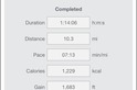
Once that’s done you’ll be at the point of seeing your athlete details pane. This shows your current training levels and FTP, as well as run and swim focused metrics at the bottom. Of course, these generally tend to take a backseat within the app. It’s not as if they aren’t present, it’s just…well…less detailed than cycling.
Meanwhile, along the right side you’ve got the slices of time – such as this week, last week, this year, and so on. These are what controls the middle chunk. It’s fun looking back historically to different years where my training volume was focused at specific events – such as an Ironman (where obviously training durations are longer).

When the single athlete is highlighted, you’ll have noticed different tabs along the top. These are all different charts. Charts might be a somewhat simplistic term though, as ‘pages’ is probably more accurate. Each chart though can be saved and shared with others, as well as downloaded from a central repository. This first being the default listing with the app:

And then there is the website with more. What’s cool here though is you start to see other sports supported, for example I saw some rowing ones in there.


The charts then drive the information in the middle pane, based on either a workout or a wider timeframe (collection of workouts). There are two types of charts – Athlete and Workout. Fairly self-explanatory, but Workout charts are specific to data within an individual workout, whereas Athlete charts tend to be over timeframes (i.e. multiple months).
In this stage, because I haven’t selected a specific workout yet, these are more general metrics as confined to a given time slice on the right side within the Athlete Charts. For example, it’s fun looking at the Power Duration Curve chart, which shows where I sit as a cyclist in terms of W/kg and different durations. The shorter durations (a few seconds) are on the left side). Obviously, I’m not a sprinter. So while my ‘sprinting’ says it’s recreational, you’ll see that by time we get into the 5-minute+ categories, my ‘status’ rises up into the ‘Good’ category.

This would be somewhat expected given my triathlete focus, over a traditional road cyclist. This is called Phenotyping, and within the module it’ll actually tell you exactly which of the four categories you are (Sprinter, Pursuiter, TTer, and All Arounder). Thus it’s probably little surprise I’m classified as a TT’er, given my triathlon focus.

Another interesting metric would be the mFTP setting. This is the modeled FTP, which automatically changes as you upload your daily workouts. Traditionally speaking you’d do FTP tests on some specified timeframes throughout the season to understand this value. With mFTP, you’re getting an estimate of what the application believes you’re at, at a given point in time – likely between those tests.
There’s a crapton of places throughout the software where you’ll see your current mFTP values. For example – above you’ll see it at the top of the application – front and center. And down below in the orange line you can see it increasing over the last month – likely as I did various efforts/rides that ‘stressed’ that value.

But at the top you also see sFTP. sFTP is what you’ve set within the application manually. In my case I tend to leave sFTP at 295w lately, merely because that’s the last time I did some tests in that area (a long time ago). Right now the mFTP of 291 makes sense, though it’ll vary based on the rides that I’m doing. I suspect if I was doing training efforts that were more structured right now I’d probably get more accurate results. Versus most of my rides are just summer wandering around the greater Paris area, usually without too much focus or specified intensity.
There are numerous ways to display trending power data, be it Mean Maximal Data (MMP), or any of the other tabs along the top that can be customized. MMP though shows up most often within a number of charts.

The below is a bit different than you usually see, in that the stacked element makes it more clear for timeline purposes. Versus a traditional MMP graph encapsulates an entire time slice (be it 1 ride or 1 year) in just one line, so it shows less historical data.

But, if I dive into the customization, I can change it back to horizontal lines instead:

And the result:

Also on the new/updated front is data dealing with left/right metrics. This is notable because of much of the discussion around whether left-leg only power meters impact things. In my case, you see the same thing that graphs two years ago as part of my Garmin Vector In-Depth Review showed – that once I get close to and exceed my FTP, things go out the window. In theory these two would match if I was perfectly balanced across all power ranges. On the flipside, I’m not quite clear where these 2,500w+ wattage numbers are coming from, since I had no power meter generate such figures anytime in the last 30 days to my knowledge (I usually top out in the 800-900w, as shown in the MMP graphs earlier).

This is definitely interesting data, and is something that aligns well with some of my recent commentary on the challenges of left-only power meters. Further, it also aligns with some of the discussion I’ve had with the BestBikeSplit guys (now also part of TrainingPeaks) that left-only power meters are a bit challenging for some of their big data type analysis.
Below is the trending for just the last 30 days of my left/right balance. I was going to show you the entire 2014/2015, but alas, that report fails to generate for some reason. Now below is of particular interest because it shows the effect of two different power meters. The line is where I switched from the PowerTap P1 to the bePRO units. Did my pedaling style change? Or was it just a shift in units? Even within a given unit though, you can see a small shift. Hopefully I can get the full year reports to work – especially the 2014 report – as that was fully on a single unit type (Vector) and would certainly be interesting to look at (I generally keep my TP data ‘clean’ when possible, meaning I usually keep to the same PM there).

That said – all of this is only focused on vanilla left/right power, with a single page on pedaling smoothness and torque effectiveness. None of this leveraged any of the fancy Cycling Dynamics data. You’ll remember my recent rant last week on the lack of usefulness of that data, and this drives home that message. Obviously WKO4 will receive updates in the future, but at this point – it’s just not there from a leveraging this data standpoint. In my discussions with them, they essentially said they’re still waiting on Garmin to provide access to that data.
But still, there’s no guidance from any of the folks behind WKO4 or Training Peaks on how coaches could actually use this left/right data in a training/racing scenario. While it’s easy to say one should try and make something balanced – there’s zero scientific support that’s doing so is actually a good thing (in fact, much antecdotal evidence shows doing so reduced total wattage).
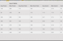
As for all of the normal metrics you’d see on TrainingPeaks or WKO in the past? They’re pretty much all here. I wasn’t a huge WKO user previous to WKO4, so I can’t 100% say that every tiny feature people used is still here. I can say that coming from Training Peaks I see most of what I use day to day in the application. For example, things like PMC and CCC, for example. This one though with the twist being running-focused:

And digging into a given activity view, you’ve got much of the same core information about a workout as you’d see in TrainingPeaks, for example the basic charts and maps are all there (and again, the ability to add custom ‘Workout’ charts).

You can change both tabs up top as well as down below. So you’ve got various packs, which inside them have additionally configurable data tabs. Pretty cool though in that these could then be customized:


But ultimately I think the power of WKO4 is really around the customization aspect. Taking the MMP graph as an example we can tweak a slew of attributes there. We’re seeing that already within the Wattage Forums with people trading graphs and charts, which is no doubt going to make the application more viral in nature.
Of course, we’re also seeing the Wattage Forums people having some early teething pains. Which is I suppose common with most new software. For example there’s plenty of discussion around the mFTP pieces. Something I’ve seen in just the two weeks using it, with respect to how variable it is (perhaps too variable). There’s a heavy dependence on doing efforts that would otherwise drive up the FTP. Thus it doesn’t seem to take into account as well my more casual summer riding style. Only after doing some harder efforts did the FTP slide from in the 250ish range up to the 290w that it’s set now.
Further, there are cases where figures just don’t align from TrainingPeaks. I’d have expected complete convergence between them. A great example is the sFTP value, which isn’t coming from TP, where in my zones a 295 threshold value is set:

Nor does it seem to properly pull new weight metrics – as I had to correct the 150lbs that was in there for the right 175lbs:

You’ll see both of these were incorrect on WKO4 until I manually corrected them:

Also, that lack of integration goes into things like training levels, which doesn’t pull any of my power zones from TrainingPeaks that were previously setup. Nor does it give the option to:

And then sometimes reports just don’t pull data as expected. For example, this report seems to imply I haven’t biked at all the first half of the year, but when reports are generated for just 30 days – no problems.

Now, I’m sure these sorta things will be fixed quickly. In fact, this morning a new build showed up automatically and offered to install it for me:

And I’m sure my minor items will also be collected along with feedback from the Wattage Group (since the WKO team is very active on the forums there responding to comments), and probably processed appropriately.
So do keep that in mind that these are just short examples I found – and that if you come back here a month from now I’d be rather surprised if they weren’t fixed. Though, as I noted recently in a podcast, while I might make brief mention of future fixes here, one of the core reasons I don’t tend to do app reviews (of any type) is because apps change so quickly that doing app reviews of all apps in a space every time they updated would just be madness. And I’ve often found that app companies get somewhat upset when I don’t immediately update my review for the things they’ve changed or fixed some time after publication. So do keep in mind that this is just a snapshot in time, and time moves on.
Pricing & Availability, Thoughts:
So what’s all this cost? Well, the WKO4 app is initially being offered at $179USD (one-time purchase), though will ultimately be $199USD once they get past the intro offers. There’s also an upgrade path for existing WKO folks at $129USD initially (and $149USD later).
The bigger question is whether or not the entire concept of a paid desktop-only app actually makes sense. In this data and age, the majority of daily-use functionality that most athletes use is already within TrainingPeaks online. Where WKO4 gaps away from TrainingPeaks is in the customization elements, as well as some of the newer modeled metrics. But one would have to believe we’ll eventually see those in TrainingPeaks (TP) anyway.
Of course, if you’re one who doesn’t want your data stored ‘in the cloud’ (aka: The Internet) then yes, WKO4 is definitely a better choice than Training Peaks. But I would certainly also evaluate the very capable desktop-only app Golden Cheetah, which is free.
On the flip-side, the power behind the customization of athlete and workout charts and packs is massive. The more I dug into it, the more I realized just how much there is – both in terms of data there today and customization of that data. If you were a coach and had very specific graphs and charts that you wanted when managing numerous athletes, you could really nail the interface to show you precisely what you wanted (and only that).
For the ‘average’ athlete though (and in this context, average means an already advanced athlete technologically or data-geek wise), it’s going to be a tougher sell to pitch WKO4 over TP. You’ve got to really want to dig into the details and drive heavy customization to be worthwhile. But everyone has different priorities.
Thanks for reading!
FOUND THIS POST USEFUL? SUPPORT THE SITE!
Hopefully, you found this post useful. The website is really a labor of love, so please consider becoming a DC RAINMAKER Supporter. This gets you an ad-free experience, and access to our (mostly) bi-monthly behind-the-scenes video series of “Shed Talkin’”.
Support DCRainMaker - Shop on Amazon
Otherwise, perhaps consider using the below link if shopping on Amazon. As an Amazon Associate, I earn from qualifying purchases. It doesn’t cost you anything extra, but your purchases help support this website a lot. It could simply be buying toilet paper, or this pizza oven we use and love.