
Earlier this week Garmin announced the beginnings of a revamp of the Garmin Connect Mobile app – something that many people have been eager for…for many many years.
As part of this revamp, they’ve also opened it up to public beta, so you can poke at it yourself, and provide feedback on what still needs some love. While Garmin started that public beta access part on January 8th, there isn’t the option to manually join it, rather, Garmin is slowly rolling out access to join the beta, and like roll-outs of new firmware, they’ll expand the ability to join it each day.
Walk-through:
Thus, I figured I’d give a walk-through of what things look like today, until your toggle gets lit up. Of course, the video above does that as well, with a bit more details/thoughts/suggestions along the way.
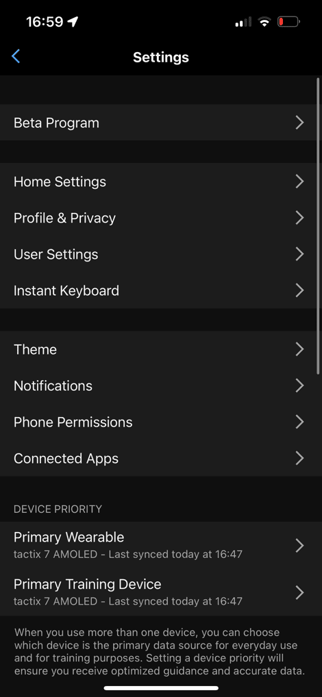
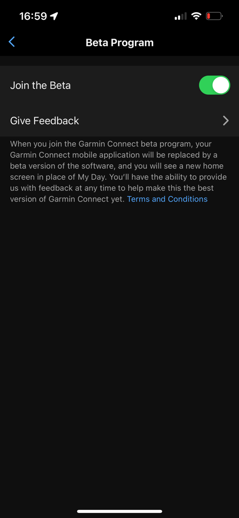
Speaking of which, in case you somehow dismiss the beta invite in the app, the Beta App toggle is otherwise in the app under: More > Settings > Beta Program > On/Off (you can leave/join as much as you want, once your account has been activated).
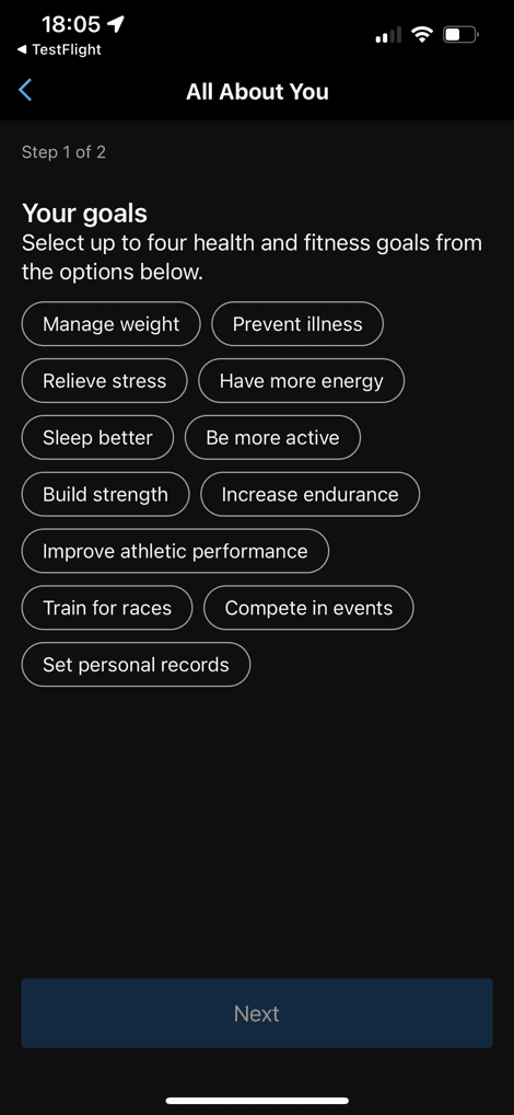
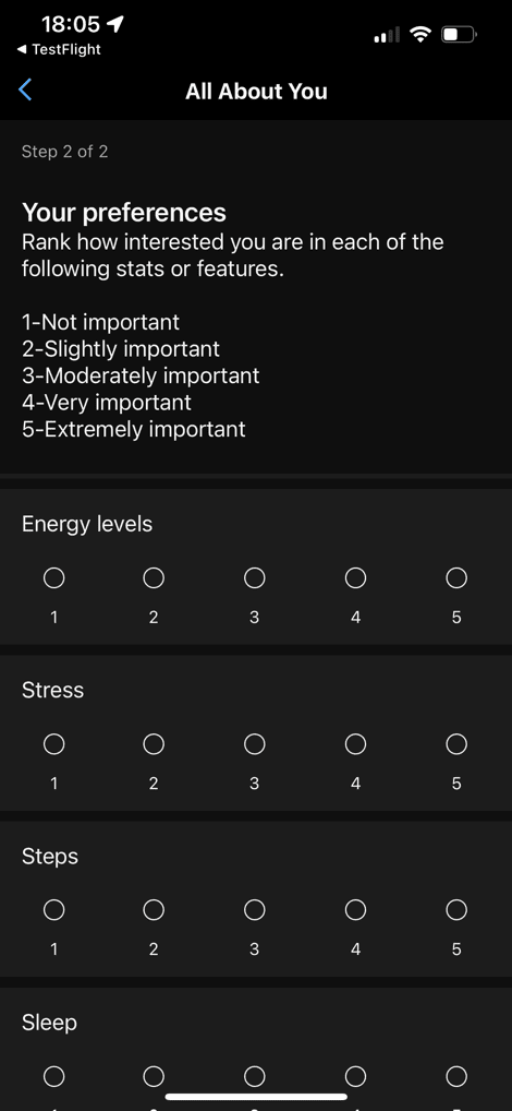
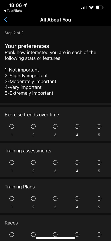
Now, once joined, you’ll get a Quick Start guide, that asks you about the areas you want the Garmin Connect app to surface/focus on the most. The first page is general areas, and then the second page is a longer list of priorities that you assign a 1-5 score. After that, you’re done:
From there, you’ll see the new revamped home page. This home page is roughly divided up into four sections:
1) Latest Activity/Planned Workouts: Pretty self-explanatory
2) In Focus: A set of five swappable tiles each focused on a different training/health related thing
3) At a Glance: A bunch of tiles of various training/activity/health stats
4) Events/Training Plans/Challenges: A place to check-in on scheduled things you’ve joined
There’s also a secondary piece of sorta non-configurable information that lies between The ‘In Focus’ and ‘At a Glance’ tabs, that you’ll see in a second.
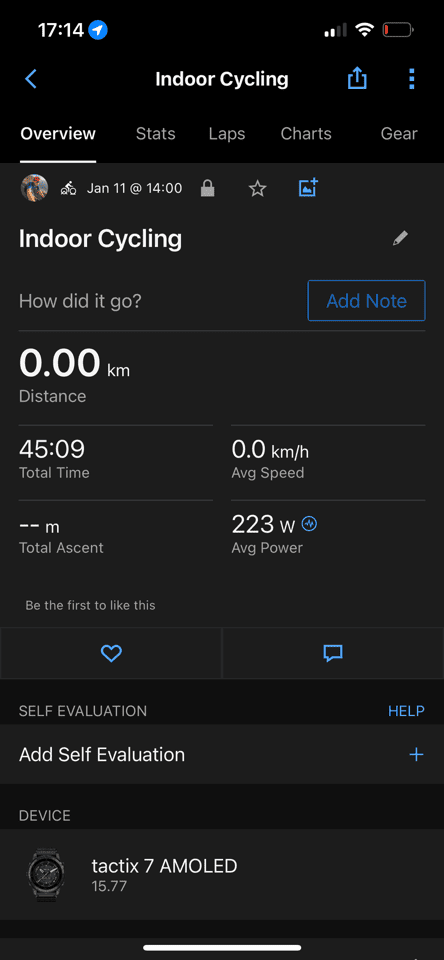
First up though is the ‘Today’s Activity’ panel. That shows any completed workouts from today, as well as any scheduled workouts (such as those from a 3rd party training platform like TrainingPeaks or TrainerRoad, as well as Garmin’s own internal coaching systems). Tapping on these simply takes you to the existing activity screen (if it’s a completed workout), or details about the planned workout. You’ll notice that virtually all of the changes here in the app revamp are on the ‘Home’/Dashboard page, and not other areas of the app that have additional details. Some pages, like this activity page, saw some minor UI changes this past fall already.
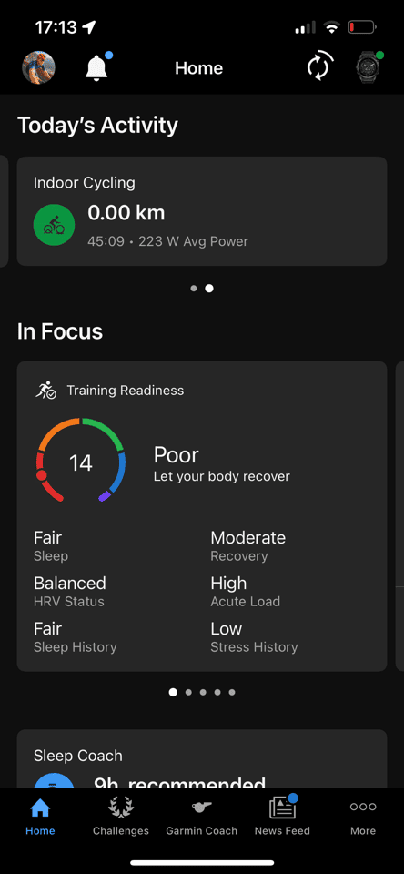
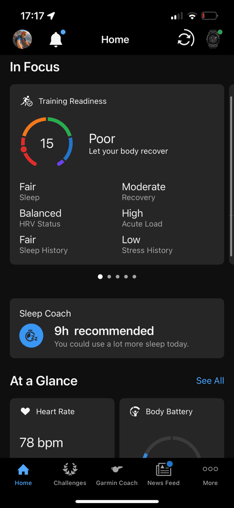
Next, below that is the ‘In Focus’ panels. These are a series of up to five customizable panels (you choose what you want), that you can swipe left/right through. Each of these panels has a focus area, and if you tap them, you’ll get brought to a more detailed section of the app (identical to before).
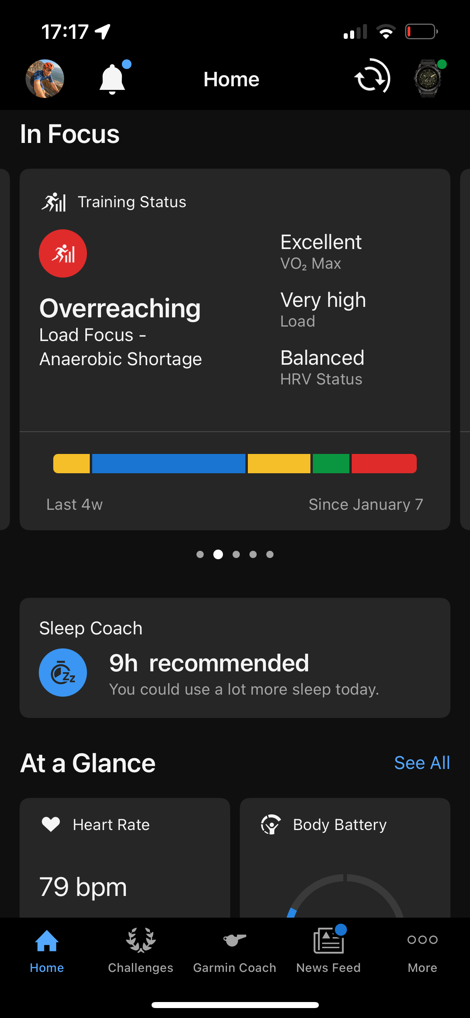
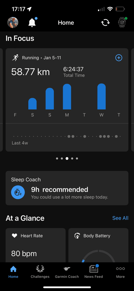
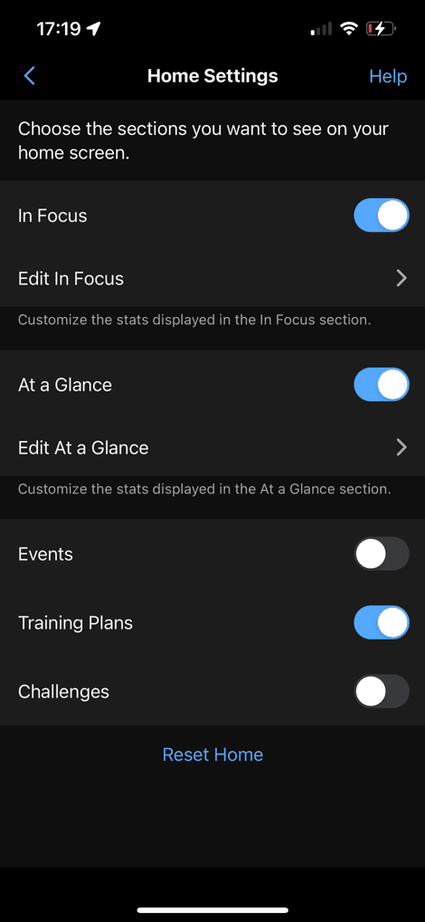
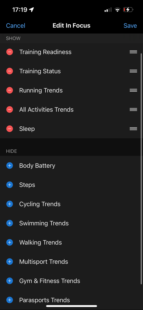
You can customize which panels are selected via the settings, again, up to five of these:
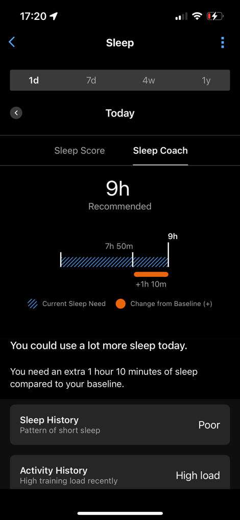
Below that, we’ve got the no-mans land metric, which in my case is Sleep Coach. This is likely because for one of my focus areas, I selected sleep. And, Garmin decided it was going to put the single feature I find least useful in that spot (Sleep Coach). There doesn’t appear to be a way to change this directly, though indirectly I could change my focus areas. I’d like to see this be more changeable directly, and also not necessarily be a duplicate of what’s above/below.
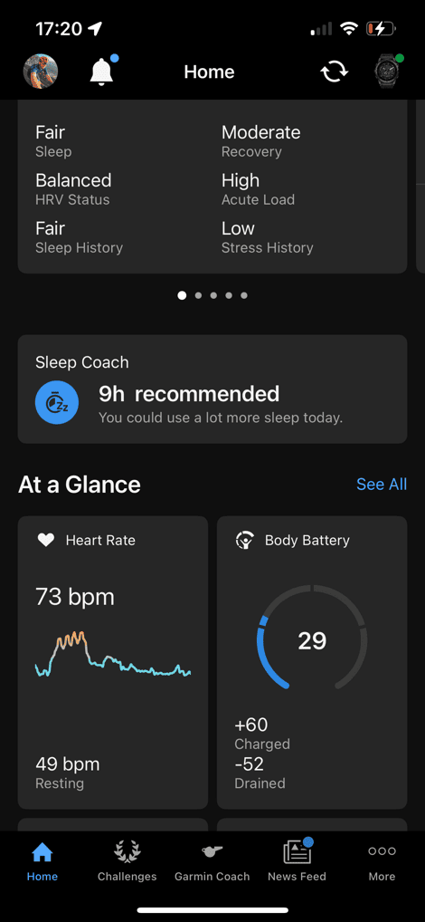
In any case, below that we’ve got the ‘At a Glance’ metrics, which are small cards showing you various data metrics. You can have up to 8 of these on the homepage, but it’ll show the rest on a secondary page.
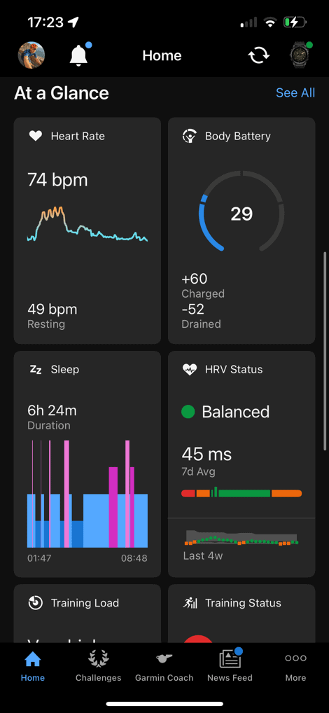
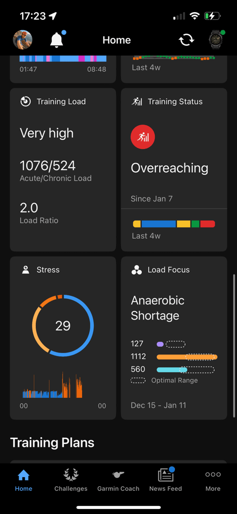
If you tap on any of these cards, it’ll bring you to the previously existing data page/report on that particular item. Again, the secondary pages it links to haven’t changed at all (more on that in a second).
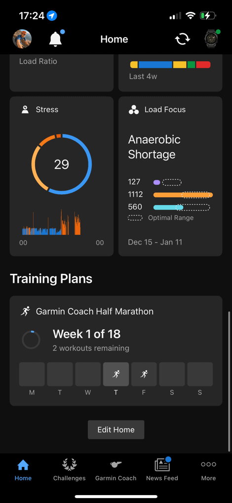
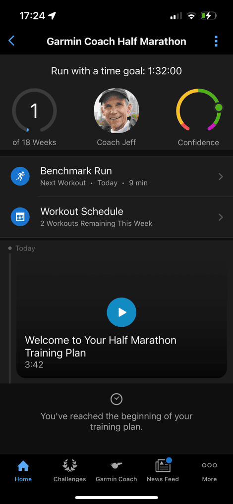
After that, you’ve got the Training Plans, Challenges, and Events section. This is where you can toggle none, some, or all three of these, and if you’ve got these configured in your Garmin Connect account, it’ll show data about what’s upcoming. In my case, I quickly threw a half-marathon plan on there, just to illustrate this:
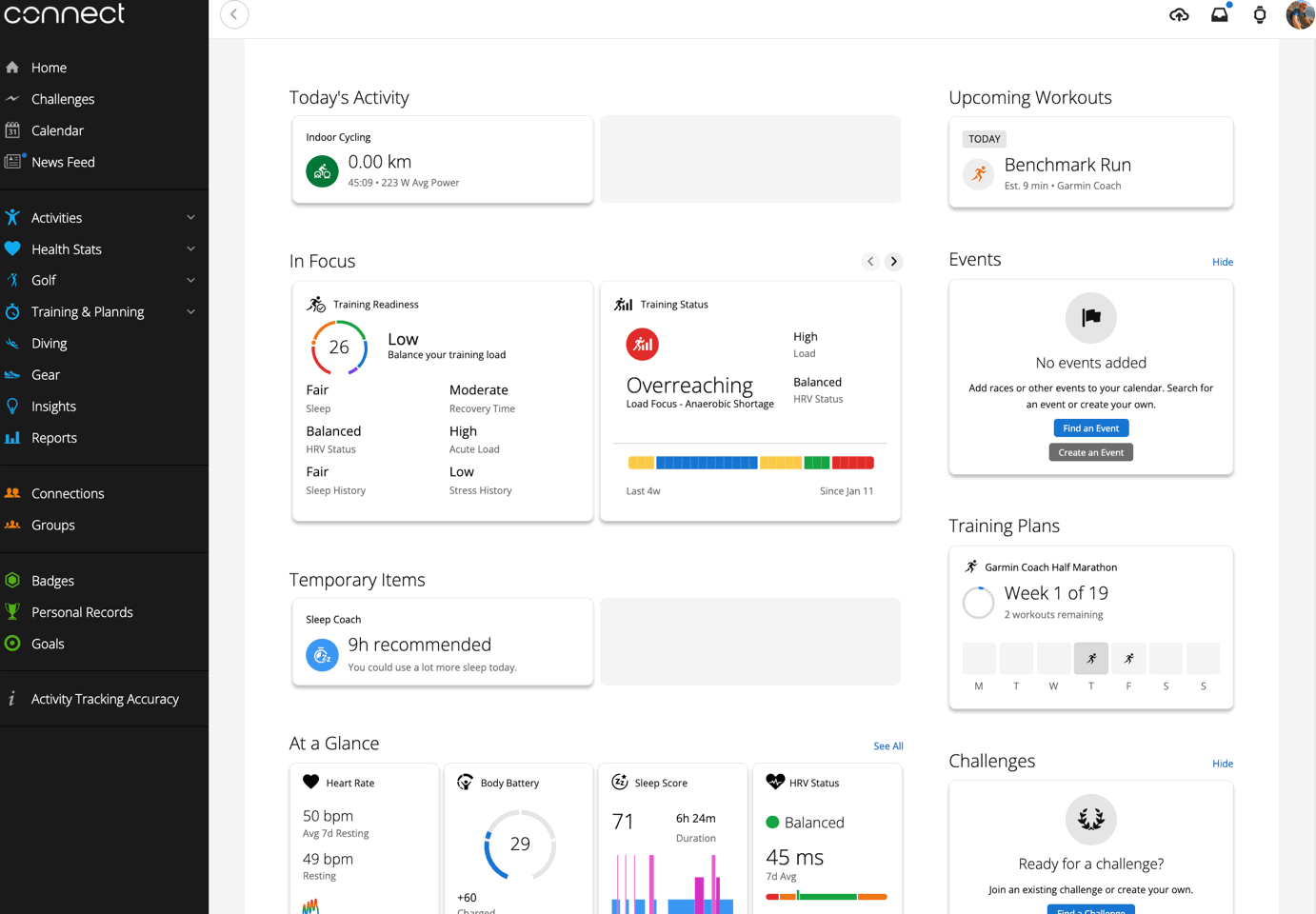
Finally, Garmin has also revamped Garmin Connect (desktop/website) to match all of this, which includes the home page specifically. Also, it’ll automatically sync changes of your ‘design’ from Garmin Connect Mobile, to Garmin Connect website, which is a nice touch:
So, what are my initial thoughts?
Wrap-Up:
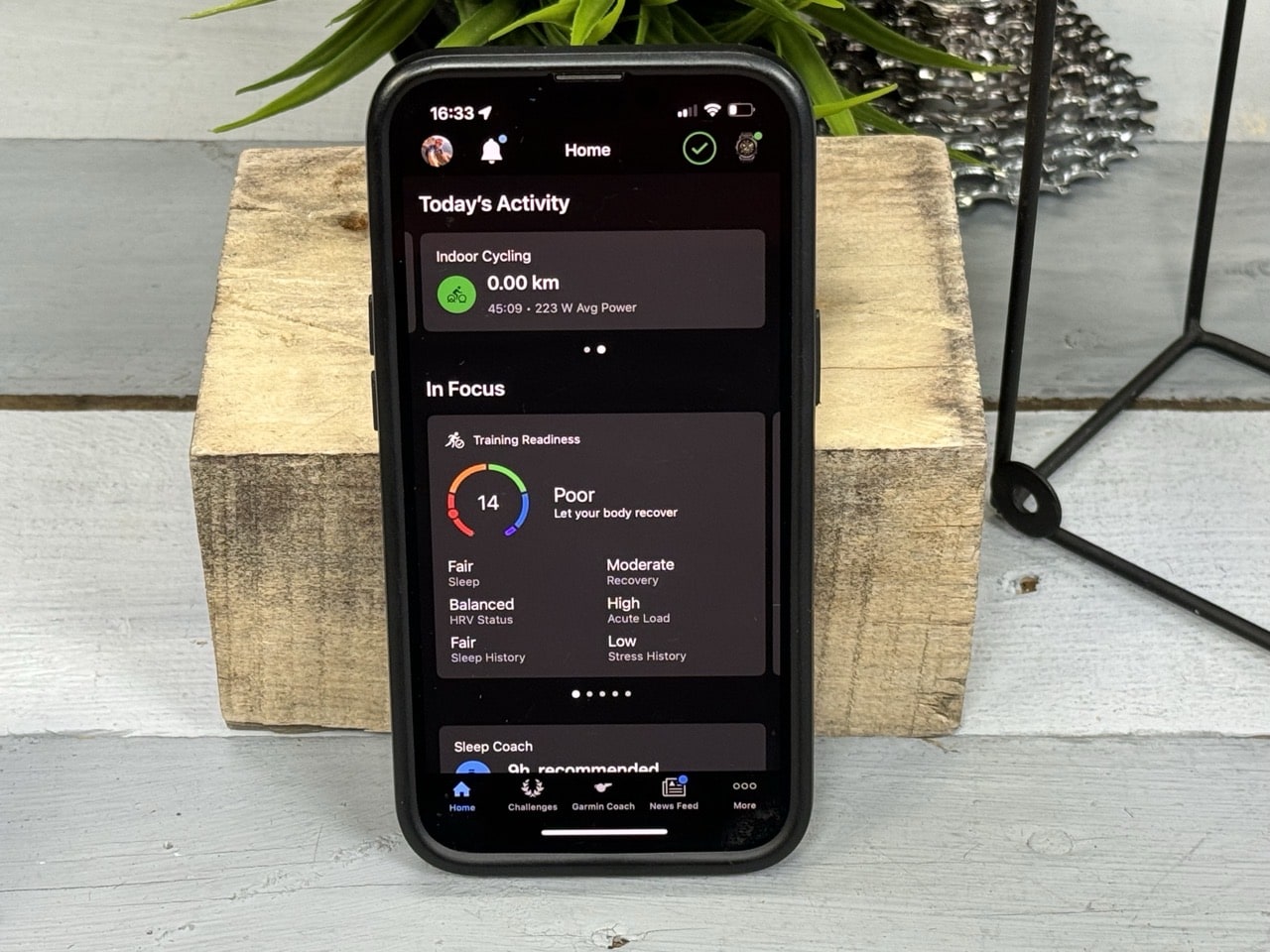
It’s important to note that Garmin says the focus area for now is on that ‘Home’/Dashboard view – not on the rest of the Garmin Connect app. In other words, it’s on the thing that people see first and foremost, and see every time they open the app. That’s concurrently the piece that it seems most people complain about. The general consensus being many find the Garmin Connect Mobile app cluttered and full of confusion, especially if they’re new to the platform.
Thus, this revamp is clearly aimed at that criticism, and trying to make it simpler and more clear on your home page, as well as offering what are effectively quick-links to a deeper look at those particular data bits (e.g., Training Status or Stress). Meaning previously, to access some of that data, you had to fumble around more places, or the whole thing was simply overwhelming on the dashboard.
Garmin is not however on this go-around, addressing the rest of the Garmin Connect App. And honestly, I think that actually makes sense. One of Garmin’s advantages (if you can get out of the Home Screen), is that they’ve got FAAAR more data than any other sports-focused watch out there. Only Apple’s ‘Health’ app/database rivals it, but much of that data is more focused on Health/Medical/etc stats than the performance/training/recovery stats that Garmin has. Two different things obviously.
But the point there being that I rarely hear people being upset at Garmin’s depth of data, rather, the organization and accessibility of it. This seems to address that initial accessibility/organization side well. I’d just hope if they continue beyond the home page, they don’t dumb things down, or otherwise limit access. Many times when companies do user interface revamps, it’s at the cost of useful data. Even Garmin themselves if we look at the ‘Training Status’ panel on the updated home page, got rid of the actual training load #, some that’s kinda-sorta the most important number (instead going with more generic terms). Of course, hopefully with beta program, people will provide feedback that Garmin can act upon.
And finally again, Garmin hasn’t provided a timeline for when exactly this will hit product for everyone, nor when everyone can toggle it on/off in beta. But at least initially, this is a good start.
Thanks for reading!
FOUND THIS POST USEFUL? SUPPORT THE SITE!
Hopefully, you found this post useful. The website is really a labor of love, so please consider becoming a DC RAINMAKER Supporter. This gets you an ad-free experience, and access to our (mostly) bi-monthly behind-the-scenes video series of “Shed Talkin’”.
Support DCRainMaker - Shop on Amazon
Otherwise, perhaps consider using the below link if shopping on Amazon. As an Amazon Associate, I earn from qualifying purchases. It doesn’t cost you anything extra, but your purchases help support this website a lot. It could simply be buying toilet paper, or this pizza oven we use and love.







Is HR graph from the session still a giant red lump? There’s still no HR zones overlay?
No change there.
I would kill for them to have the website-based activity customization options that Movescount/Suunto had 8 years ago. The ability to create & customize screens for an activity without using the watch directly is so nice, and trying to do it in the Connect app (for me anyway) has always been a nightmare of pressing buttons & the app ignoring them because the Bluetooth connection to the device blipped.
Great review as usual ray :)
Out of curiosity whats with the differernt zwift layout 2mins 10secs?
Thanks.
That’s actually Indievelo: link to indievelo.com
I suspect the answer is “no”, but are there any changes to the data that Garmin Connect writes to Apple Health in this version? (Now that Apple Health supports things like running and cycling power, I’ve been hoping that Garmin Connect would start writing that data when it sends completed workouts there.)
I know Garmin has tweaked a few things over the last few months on Apple Health writing, but I honestly don’t follow it super close.
That said, I don’t see cycling power data from my Garmin-watch recorded workout populating today’s Apple Health cycling power fields, despite having Garmin to Apple Health fully connected.
Wish/hope that Garmin would add Goals to the cards on the mobile app page. I use that pretty frequently.
there is no beta toggle? I have android, GC version 4.74
edit, read it again, patience
got an update today to 4.74, but still no beta toggle
From garmin website: How Do I Join the Beta Program?
At this time, the Garmin Connect Beta program is only available to select Garmin Connect users. If invited to join the beta, and provide feedback, you will receive and invitation in Garmin Connect. The amount of users invited to join the beta will increase over time.
So, not for everybody
It’s rolling out slowly, you’ll find random people on Reddit that got access on the 8th and beyond. How exactly Garmin has decided to select those people is a bit of a mystery. Ideally they’d start with people who have a Garmin device enabled for beta already (thus showing some level of interest in beta testing), but no idea.
Or, alternatively, they’d allow people to join, and then batch approve access.
While that kind of makes sense, I can tell you I am cool to join the beta for anything but the device I’m actively recording a workout with. So I would definitely join this beta, but not for my devices.
From your screen shot of the web based interface it looks like they have gotten rid of Dashboards? Sad Panda if they do this. I use different dashboards to track activities/goals/metrics/gear usage associated with different sports/activities (i.e. Road Biking/Running/Swimming/Hiking/Gravel dashboards).
As far as I can see, that’s correct.
That’s one gap – there’s no longer a yesterday/this week/month type summary there used to be. Maybe nobody used it, I don’t know.
That’s annoying for my scuba diving activity, which is non-existent for part of the year and a flurry for the rest of it so it made complete sense to have it on a separate dashboard.
Hi,
FWIW I always like yesterday & last week. Gives me a quick glance of trend over week. Quicker than going to each card individually.
Tnx.
I got the update a couple of days ago, and that’s correct…no more dashboards, handy graphs showing goals and progress, mileage on the equipment. easy access to my devices, or any of the things I actually used. My take is that neither the app nor the web page offer anything more than what’s already on my watch or bike computer, unless I dig for it, and even then things like goals are not as simple graphically. Overall, very disappointed and would happily revert to the old webpage with the faults that it had.
The Classic version of Garmin Connect when will be restored?
Or when will be the Garmin Connect more customizable?
When will be the data visualization more customizable?
Not sure I understand, what’s the ‘Classic version’?
Until cca 2017 there were two parallel platforms to view activities. One was a Classic and a newly developed one was a Modern.
Then they turned off the Classic, so the only remaining was Modern.
Its name remained on the URL, for example, connect.garmin.com/modern/profile/dcrainmaker
Another issue I had a problem with was a Recovery Heart Rate.
Since 2009 within my Forerunner 310XT, I have been begging to make it visible on Garmin Connect.
– It is not possible. was the answer. Till the Forerunner 945 generation, where they silently implemented this data on Connect…
Thanks Ray for the helpful (as always) review
Does this Garmin Connect update do anything to improve the connectivity with Garmin’s own devices?
For the umpteenth time I’ve just got in from a ride, recorded on an Edge 830. Just would not sync/upload despite turning device and iPhone off/on
Had to resort to forgetting/deleting the Bluetooth connection and starting the whole pairing process
If only that was a rare necessity…
To be honest, that’s more of a Bluetooth connection thing with the older legacy Garmin dual-bluetooth connected devices (e.g. Edge 830 and everything Edge before the Edge 540/840/1040). On the x40 series, they got rid of the wonky dual-Bluetooth connections, which solved virtually all of those issues.
The interface still looks like it’s designed in the twenties, I wish they would modernise their design system. Something a little more like Whoop.
As always, design is subjective.
However, what’s more objective here is that Whoop has a relatively tiny amount of data to display/surface. In terms of raw stats Whoop collects/has, I’d guess it’s about 1/100th that of what Garmin has (in terms of stats). Even if we boil those down a bit, it’d probably still 30:1.
Garmin’s challenge has always been to balance the fact that one person may love one thing, and another not care about it. And with so many features, there’s a lot of potential variance. Whereas Whoop doesn’t allow/have any of that customization.
Not saying Garmin shouldn’t improve, but just the reality that Whoop is a very simplistic device in comparison to the breadth of Garmin devices/features/stats that Garmin has to consolidate in the GCM app.
Aren’t we currently in the 20’s?
I don’t see that option to join the beta using the path you mentioned. My Garmin Connect s/w is 4.74.1.3
“While Garmin started that public beta access part on January 8th, there isn’t the option to manually join it, rather, Garmin is slowly rolling out access to join the beta.”
So I’ll have to swipe to see more than 1 activity in a day. This is terribad. The rest is ok I guess.
At 2:10 in the video…indoor cycling of 45 min and an avg of 223 W. And, yet, 0 km. If Garmin is looking for bugs…
It’s not a bug at all though.
The watch feeding that data was connected to a power meter, not a trainer with speed/distance.
One might quibble the bug is more that Garmin prioritizes distance as the main metric a cyclist would want to see. I’d prefer power be the primary metric, especially in cases when there is no distance.
Ugh, just let me configure what’s displayed on my device using the app.
But you can?
Basically all devices released since early 2022 allow this.
theoretically, but it’s incredibly clunky to the point of not being worth the effort much of the time
Strange. I don’t see the option to join the beta program?
At the top of the article
“ While Garmin started that public beta access part on January 8th, there isn’t the option to manually join it, rather, Garmin is slowly rolling out access to join the beta, and like roll-outs of new firmware, they’ll expand the ability to join it each day.”
Is the expand / collapse option still on the home screen? The collapse makes it easier to read and review only the statistics you may be interested at the time.
Will it sync offline?
My biggest gripe about Connect is not being able to sync my watch if I’m on a hike without access to mobile data
^ this would be a big usabiity improvement
No change there.
Does the new app move away from MFP integration? They were still showing UnderArmor branding in the app even though they stopped that partnership a long time ago. Will they have native calorie tracking?
Rather than do their own calorie tracking I’d like to see them open it up to other third party apps. There are already a lot of them that can pull fitness data from Connect but none of them except MFP can write calorie intake to Connect. Changing that would probably just require them to update the API vs putting together their own calorie tracking solution.
Cool story but there is no beta program on the current iteration of GC as of 1/12.
Cool story, but, I put it in the second (short) paragraph, and even bolded it….
Thanks once again Ray.
One quick question I have is whether you see the daily suggested workouts in the new UI. By daily suggested workouts I mean the workouts that Garmin watch suggests automatically based on an event you have planned.
At the moment, my watches are rather insistent I rest. So…I’ll let ya know when it gets back to DSW’s showing up. :) Maybe tomorrow.
My guess would be they won’t as they’re generated on device aren’t they? I have a FR745 and an Edge 530, and they don’t suggest the same workout (My Edge never suggests a run…. wonder why? :P ) So not sure which one connect would pull and show me? (both would be cool).
But, I’m perfectly happy with the current design, will it be possible to keep that?
Hi Ray. What if I do not have beta option in my ‘more-settings-….? It seems that it is missing from my garmin connect app
Mountain biking and photography Gopro
Hello there!
Do you know if they plan to add iOS widgets? Because it’s relly something that could be great: training readiness, body battery, training status… even hydration status.
Could you please pass the request too?
Thank you very much !
Hello Ray,
Thanks for the walk through. From my understanding they are not adding much features, more like visual change.
Do you think any day they will kinda merge garmin explore and connect?
It’s kinda annoying to have bought the 965 that was stated as compatible with the explore and now they taken out that feature, and so you can’t sync POIs wirelessly with it.
An all in one app like suunto could be good.
Have a great day
Thanks for the update! Since you mentioned training plans, any chance Garmin will let us create our own training plans in Connect? This is one of those things I’ve wanted them to add for a long time and maybe since they are revising Connect they’ll finally consider doing it. It’d be great to be able to add my triathlon training plans and then put them on the calendar whenever I started a training cycle.
Seems focused on wearables. As a head unit user all I want is a way to configure my screens without fiddly head unit touch screen/button menus. Let me drag and drop my screen design on the big easy to use phone u have and push it to my head unit. Please?
Thanks Ray!
Have you tested the new training plan widget with an external app such as TrainingPeaks, or does this only work with Garmin training plans?
Currently, I see my imported plan from TrainingPeaks in today’s “Scheduled Workout” card at the top of the home page. Hopefully that won’t be affected, since the Garmin training plans are pretty silly, as you noted there isn’t even a marathon plan.
Thank you for this detailed review of the Garmin Connect Mobile app revamp. Garmin’s approach to simplifying the user interface while retaining data depth is impressive. I particularly appreciate how you highlighted the improvements to the home screen and new features like the ‘In Focus’ and ‘At a Glance’ panels. This seems like a significant step forward in making the app more intuitive for new users while still being useful for experienced ones. I’m looking forward to seeing how Garmin continues to evolve and enhance the user experience in future updates. Your thorough analysis really helped me understand the changes and what they mean for my own use of Garmin Connect.
Maybe I’m the only one, I’m hoping for a compact version that mimics the current layout on connect. I font want to scroll to find each little tab.
I have some very simple requests for Garmin to add to the Connect app/ web site:
– allow me to set the y-axis of my charts manually.
– allow me to add photos of my gear (shoes).
I suspect that the relative lack of software development (vs hardware and features on watches) is related to the financial model. I’m happy that the price I paid for my watch many years ago somehow still covers the use of the connect service but I guess it shows in lacking development.
You rarely hear people being upset at Garmin’s depth of data? I miss the most obvious thing, a good summary of total training amount and development for all activity types over time. Not available on Strava either or am I missing something? Is there a good place for this type of summaries and analyzes other than custom excel worksheets? Perhaps you can write a post about which tools you use for long-term follow-up and evaluation of your training?
It depends a bit on *what* type of “training amount” you mean. e.g. time, distance, training load, etc…
For Load based stats, via the phone app:
Performance Stats > Training Status > Training Load
Then you can do it as Load Focus, Excercise Load, or Training Load. But from the mobile app you can’t specify other timeframes beyond 28d chunks, but you can on Garmin Connect web.
For certain activity types, e.g. running/cycling/swimming/walking/multisport/gym, you can easily do the 7d/4w/1y graphs for any time period showing distance, time, ascent, calroies – all via GCM. But, as you noted, that doesn’t oddly include ‘All Activities’.
Meanwhile, on Garmin Connect you can include all activities more easily in this stat, against a crapton of variables on the left. Though, you can’t pick two exact dates. Just sorta pre-canned dates.
I agree that this at first glance seems obvious, but I think that’s Garmin’s biggest challenge. For me, this has honestly never been something I’ve cared to know or look for. And it’s sorta the opposite problem Garmin has: Which is that their devices cater to ensuring everyone has their 1% feature. Meaning, the most important feature in the world to them, but only 1% of everyone else uses.
Just a tip, I am auto-exporting everything from Strava to Intervals.icu. Then I can check a bunch of different data there, see the summary of all my activities, see form, fatigue, etc. Check it out, it is free. The UI is not the most intuitive but the tool itself is really capable.
link to intervals.icu
Does the scaling on ipads finally work now? As long as a big company like garmin doesn’t manage to program simple scaling, I’d rather stick with polar, where it has worked since the beginning.
I just checked on my Mini. It scales, but it’s still just an iPhone app. Works just like the iPhone app.
Thats what i mean. on an ipad (non mini) you have big black frames and the scaling is terrible. It is not sharp.
I do not have an option for Beta testing under settings. AWent to the Garmin site and my Star Wars Legacy Rey watch is not eligible for the beta. Bummer.
Go here and type in your product name:
link to support.garmin.com
Your device (like mine) may not be eligible. I figure it’s because my watch is at least 6 years old.
Are they improving the graphs? Pet peeve is not being able to zoom, find min max etc. eg. Pulse always has a scale of max 200 even if my pulse never went about 120 today.
Any chance they will provide a toggle to switch all the graphs x-axis between time vs distance? They have the option on the website.
Any chance that Garmin would be allowing more activity types to be choose from in the Gear tracking? I saw this requests many times for a long time and still we can’t choose a different shoe/ bike for virtual training or gravel riding. =(
Any way to make the font larger on edge 530 with this new update?
Maybe sometime in the spring I will see the Beta option. :-(
what if i cannot see the beta program on my mobile
i have the beta on my 965 watch
but i cannot see the beta on my android phone.
Then you are not a “Garmin Connect Beta” chosen one. I’m on the Garmin Watch Beta opt-in. I’m still waiting to see if they push the Garmin Connect Beta to me.
As Ray wrote above: “While Garmin started that public beta access part on January 8th, there isn’t the option to manually join it, rather, Garmin is slowly rolling out access to join the beta, and like roll-outs of new firmware, they’ll expand the ability to join it each day.”
Indeed. I have zero idea what criteria they are using – but plenty of people on Reddit (and interwebs at large) have access to it.
Personally, I’d have thought they’d start with people who have a recent Garmin device already enrolled in the hardware beta side, and then go from there to perhaps to those who request it, and then finally offer it to random people.
My Connect wishes are:
a) allow goals that relate to actual performance: e.g. 50 minute 10k, not so many hours or km run in a time period, the way the ‘goals’ work now. Do people really have goals of that type?
b) have notifications like “your gear has logged its maximum miles” or “you have a reply from your connection” turn up in mobile, and not just on the desktop, which I rarely log into.
c) allow gear expiries to be logged in hours and not just km. (gear pictures would be fun)
d) show the hourly change in body battery over time in the 7d view. It used to do that and now it just shows min-max. There’s a big difference between a day when you started at 80, cratered to 5 by noon and spent the day there, and one where you gradually declined, reaching 5 just before bedtime, but for the current graphs those would look identical.
e) be able to see more than one year of past data, and compare year on year.
f) be able to select to show only incomplete challenges on the challenges page
ok
thanks
I have Android 4.74.1..I don’t see Beta Program in my Setting menu….?
I have Android 4.74.1..I don’t see Beta Program in my Setting menu….? I am enrolled to 2 device Beta programs already…FOMO!
?? ‘patience young grasshopper’ ?? I’ve got major cobwebs and dust bunnies waiting to be a “Garmin Connect Beta” chosen one. Maybe I got put on the Garmin Beta Naughty List because of the Garmin HRM-Pro crashing X-C / Nordic ski profiles beta issue in late 2022 / early 2023.
I have an iPhone – no Beta for me. Perhaps, I too, am on a naughty list.
As always, thanks for the review. Sadly, even though I signed up for the Beta, I still have not been given access to check out the “Revamp”. I update my watch regularly, and I have checked regularly to see if the app is updated, but alas nothing. Any idea when this will be available to those of us less influential?
Ray, maybe you can let your Garmin contacts know that it is over 3 weeks since this post – 11 Jan and a number of us still haven’t seen the option to join this Beta. If Garmin is going to take several months before GA – General Availability of the Garmin Connect Mobile beta it would be nice to know. thanks
A friend of mine just got invited to the beta program. Doesn’t train anywhere near as much as me or in as many disciplines. You would think Garmin would want people who actually use the app to provide feedback.
Well my feedback is that Garmin should work out who is using their products and for how many years and ask those people for feedback.
Well, in the beta they took away the 3 dashboard I made for myself and no longer able to access them. I left that as feedback and opted out of the beta to get my dashboards back.
To add: this is in the webversion of Connect.
I have tried out their beta-version now. And it was a short test. I am using an iPhone 12 Mini and with a screen that small, the amount of scrolling to see anything with the new layout is insane. I have switched back to the standard version and hope they hear my feedback, because putting that much less information on the screen is the wrong way to go…
Since it is after 2-14, or 14-2 across the pond, Garmin Connect Beta must be “feeling the love.” I finally got the beta option this afternoon, 16 Feb. Now to kick the virtual tyres.
Your review is very thorough about Today.
You don’t mention anywhere about looking at past data and trends longer than the current day.
It is available via Calendar. Good coverage actually.
On the Calendar page is all sorts of blocks and a number. I assume it’s a reference to goals achieved on that day. But so far I’ve not found any explanation as to meaning anywhere.
Is there still no different “default equipment” for similar-yet-different activities (e.g. MTB vs road bike vs indoor).
I haven’t found a way to do that. On Strava I use a third party app, ActivityFix, but I don’t know of anything like that for Connect.
Man, I really miss my dashboard of “Goals”.
Ugh.
“This seems to address that initial accessibility/organization side well.” really?? A lot of people would disagree…
When it comes to UI design and change, especially at scale, you’ll never please 100% of people. And when you have millions of users, even 1% of people is still a number of unhappy people.
Garmin spent the last 4 months expanding the roll-out, and made a number of changes (many) based on that feedback, as we saw in the beta groups. Obviously, they aren’t going to change every thing people want (because those things people want literally contradict each other).
That said, given this has gone to production now, I think on the whole people seem pretty happy with it.
No they are not. 99% is negative. Garmin forums is boiling over.
Sorry, comments from Beta testers are over 90 percent angry that their dislike during testing was ignored
Thanks for trying to stick to Garmin, but this software is a sinking ship. You want simple buy a 20 dollar watch
Yeah, I guess I don’t really understand. I think DesFit’s suggestions on how to find a blend between the two layouts are actually really good, for those that prefer the old layouts.
But setting that aside, people saying they’re upset about the number of swipes to see info – if you look at any other competitive app (Suunto, Polar, COROS, Apple, etc…), it’s all *FAR* more swipes and taps to see the same info. For even a fraction of that info. As I always say no matter the company, feedback threatening to leave to another company is usually ignored when said company knows their solution is superior. Instead, hyper-specific feedback on what someone doesn’t like or likes is actually valuable to companies. Garmin will completely ignore the feedback saying you’re going to jump to another company over this (because, you won’t). Whereas, they will listen to specific suggestions, in aggregate. Again, many people’s suggestions completely contradict each other here. So Garmn will, by definition, upset some people (keeping in mind, many people were upset about the previous layout for years).
I think if you’ve got more advanced data in Garmin (e.g. Training Load/Training Readiness/etc…), the new layout is far better, as you can see more info than before with a simple swipe.
Whereas, I suspect if you’ve got less info in Garmin (e.g. mostly focused on steps/calories/etc), then you’ll likely need to swipe down once to see more info.
It also seems, from the screenshots people post, that very few people have customized their layouts, using the setup wizards. I’m not sure if people don’t like those suggestions, skip them, etc… You can see how I set up mine here: link to twitter.com
I’d really struggle to see any other fitness/endurance sports app that gets anywhere close to the amount of information I put in that single setup/layout than the new UI design. Previously would have required quite a bit more tapping to get that much info.
Garmin did post to their socials yesterday that they’re hearing the feedback – but whether or not they find some middle ground, I don’t know.
It’s amazing how, now that this has gone live, the feedback online seems to be 99% negative. The lack of accessibility, the fact that you have to make several clicks to see stuff that was visible, and the fact that you’re limited to eight tiles for health stats seems to be the main ones, with the slide design having loads of empty space and the website being somehow worse also being major criticism.
Hope Garmin recants and allows people to opt out of this for the old design.
Connect has always had flaws, but this is insane. I’ve never seen such a bad and non-functional design of any app.
I have to agree that this new UI is a hot mess. Both with Connect and Express. Several important features seem to have been either overlooked or missed.
Not a fan of the new version. Wish I could have the option to go back to the old version!
Trying to be positive, the phone App looks better and I’ve been able to configure the At a Glance to show me almost everything I wanted on mobile like the previous version (just wish Garmin didn’t limit how many I could have on the main page). The web version is a dumpster fire. The huge amount of data that Garmin collects is now more than one or two clicks to find, none of it is able to be displayed on a single page you have to hunt through multiple menus to find all the items a user was able to put on a single Dashboard in the way a user wanted. I had a separate Dashboard for each sport with the gear, goals, performance stats, etc displayed on a single page. Now it’s all gone and no way to put that “In Focus” or “At a Glance.” One step forward and maybe more than two steps forward for athletes that buy an expensive product(s) and want to see all that data easily instead of this simplistic UI.
There is an absolute uproar in the Garmin forums! 99% is very negative and extremely disappointed at the new interface, I would say.
Ive had a good look around the pc version and cant see how to add goals and gear graphs to the home screen they are the things I check the most?
For me the update is really bad:
– too much empty space, low density of data
– too much scrolling/swiping/clicking
– too little customisation
– unclear/confusing customisation – what else am I missing? What else is available/unavailable? Grrrrr….!
– add the worst: no option to toggle it back!
To add:
I did try to be positive – spend a few days using beta, did not manage well, submitted feedback. And got that horrible update in return.
What is needed to fix the new homepage is:
– allow much larger number of tiles than 8to be added, at least in the ‘custom’ option
– allow all data to be available in these tiles (there should be no data that cannot be set to a homepage tile)
– make each tile much denser in data, especially graphic. Example of a good tile: hrv tile: status ar top, then the range line, then the 4 weeks graph. Some half-empty current tiles can be merged to produce a denser new tile. Another example: last workout should have hr graph, max and average hr numbers etc
– tapping on tile should take you to the full page of relevant data and there should be no or minimal taps from there – all details should be on one level plus a bit of scrolling. There should be normally maximum 3 levels, rarely 4
– possibly get rid of swiping. Scrolling (and tapping) is enough, no need for a sideways dimension.
– consider using tiles that can expand/contract e.g. from tapping an arrow at the bottom
The above are absolute basics of any UI. How Garmin can get it so wrong is a mystery.
Example of a bad tile: body battery:
– the two numbers (+, -) should use the frees pace at the two top corners of the gauge
– the free space at bottom of tile should be used to show the body battery graph
Is it possible to go back to the old version somewhere in the connect app?
No it isn’t, stated by Garmin’s support. We have to live with it or change brand…
I went as far as purchasing a new smart watch
What good is the watch if the software is irritating and stressful… Not the best interaction with a health oriented gadget. It is rude to force software on clients that pay so much for a watch and remove customization in favor of let’s add another confusing layer and difficulty. As a older user I now have to find glasses to read the giant empty space cluttering Homescreen icons. I loveded Garmin watch… Well I will never buy another Garmin device ever. The money waisted on creating a debilitating software would have Been better spent to improve watch functions or add more choices. This is yet another example of customers NOT being listed to.
Garmin Connect has started announcing lap times on my iPhone when I’m running with my ForeRunner 265. I took a break from running, so I don’t know when this started. The default lap distance is one kilometer, so I can hear how fast I ran my last kilometer and I don’t need to look at my watch. I like it. This will be especially useful in winter when my sleeves make checking my watch difficult.
Ray probably noted this somewhere else, but I couldn’t figure out how to search through the vast amount of data on this site.
Yeah, that’s been a feature for a long-long time. A few years at least I think.
I now have this new version in my Connect. Am I the only one who thinks it’s abysmal and a total retrograde step?
I am not interested in Glances & In Focus on the web Connect. I used this for biking, I had my Activities and Gear (3 bikes & shoes), plus a couple of other things. These have all gone and I do not see where you can get them back.
On my phone I used the App with my Fenix and there I was happy with all the health & fitness status etc.. So my web & phone apps showed me different data, now they have the same, in my case nothing!
On the Web I have no “Last 7 Days”, even though I have been biking, the phone App shows these in “L7D”, so what is happening there?
The Activity only shows one day and if you have not done anything, there is nothing, you have to go into the Activities Tab to see the history etc..
At least they do not appear to have cocked up the Tabs (Calendar, Activities etc.), but the Home Page is absolutely useless for me.
I want the Dashboard back!
U R not the only one. Not at all.
I dislike almost everything about the new mobile and web apps. BUT if I could just get my “Goals” charts back, I suppose I could live with it.
HRV status stopped syncing from my watch (Fenix 6) to the app (iOS) after latest update. Anyone has some good advice on how to get the syncing going again?
(Everything else still syncs just fine).
-krimoll
HRV status not syncing isn’t likely anything to do with the latest app update, but rather either a firmware issue on the unit (the Fenix 6 recently got a different firmware update), or something else.
Double-check though that your Fenix 6 is listed as the Primary Wearable in your Garmin Connect app account. That’s what controls whether or not HRV status syncs in.
Tnx for the tip; (un)fortunately it was still my primary wearable…
The HRV recording _is_ in the watch – it seems only the _sync_ has stopped. (I have come to recall I slept one night _without_ my watch, due to the update (26.00) that I think might have caused this issue.
Any other suggestions? (apart from reset)?!
Tnx again..
If you’re getting data on the watch (and it shows last night’s data for example), that’s definitely something wonky.
For fun, try syncing your watch via WiFi instead (go into connections, and add a WiFi network if you haven’t, and force a sync that way). Also, for fun, if you;’ve got a computer with USB cable, force a sync that way too. I can’t imagine it’s syncing everything else except HRV status, so seems like something unrelated is broken somehow on your account.
I’d open a support case with Garmin. That’s definitely a weird one.
I just waited until the next update. Then it came back like it was before.
I’ve gone back and read more thoroughly DCR’s Walk-Through and looked at all the screenshots.
It’s clear that this new design is for the Health/Training/Stats/Events/Workout freaks (no disrespect to them).
It is not for people like me that buy a GPS for gps’ing; i.e. Navi; record rides/activities etc.. I am not interested in all the H/T/S/E/W data that has now become the be-all-and-end-all for the new Connect. I just ride my bike for fun & exercise and so that I do not feel guilty about having a beer at the end of the day.
For me the most important is to see my Gears and to see Activities that you could scroll through, as was possible on the Dashboard. (Why on earth do they only show todays activity on the new Webpage and not just leave up the last one if you haven’t been out? Especially as my “Last 7 Days” does not work on the Web.)
BTW: it is no longer a Dashboard it’s a Web Hompepage which is why both Web & App are the same. As mentioned in my post above, the old versions allowed two different views which was perfect for me.
God awful update, reminds me of Windows 8 fiasco. Would love to have the ability to “downgrade” back to version 4.xx
It would be really helpful if they’d let you have menstrual cycle on your Home Screen – it used to be in the old app and has been removed from Beta.
For me it’s a really useful data point to inform my training as I know how I’ll feel depending on my cycle.
I find the new GUI annoyingly clunky, forcing me to swipe through too many screens to get to the information I want to see. The display is often unreliable and it can take two or three manual syncs after the automatic ones just to get data to display. The previous GUI allowed me to see everything at once. This is a step back to the 1990’s as far as I can see.
I have to say, I don’t like it. I don’t exercise every day and a lot of the time I just want heartrate, calories, steps, body battery and to check yesterdays and the last week’s stats. Then when I do run I want my training status and activity analysis.
All this WAS available in one big scroll down my phone. But not now! Also, working in a running shop I could show customers all the metrics available at a glance. Now its tiled, I don’t find it intuitive and more work to get anywhere.
What I’d really like is a toggle option for those that want to see the old homescreen format. I’d like the choice. Not to be forced to navigate what Garmin thinks I want.